Ayo Atelier — Brand & E-Commerce Strategy
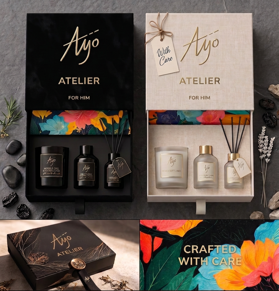
Ayo Atelier is a boutique Kuwait-based brand of handcrafted candles and diffusers, founded by Fran and rooted in French-Armenian heritage. I led the brand and e-commerce strategy across two phases, working alongside Creative Director Romain Danger, with a single commercial objective at the centre: turning a founder-led craft brand into a conversion-driven online store.
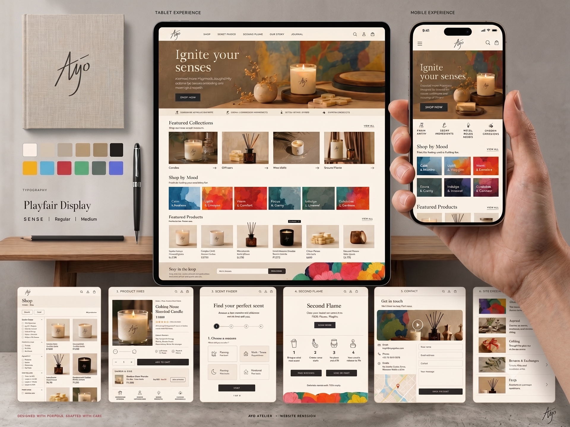
The core of the work was building a product-driven e-commerce strategy designed to guide customers from first discovery to repeat purchase. I mapped a complete customer funnel—awareness, interest, consideration, purchase, loyalty, and advocacy—assigning each stage its own channels, KPIs, and actions so that every touchpoint had a measurable role in driving sales. This was supported by detailed B2C and B2B buyer personas (the retail customer and the boutique/hospitality curator), ensuring the store spoke to both direct shoppers and wholesale partners.
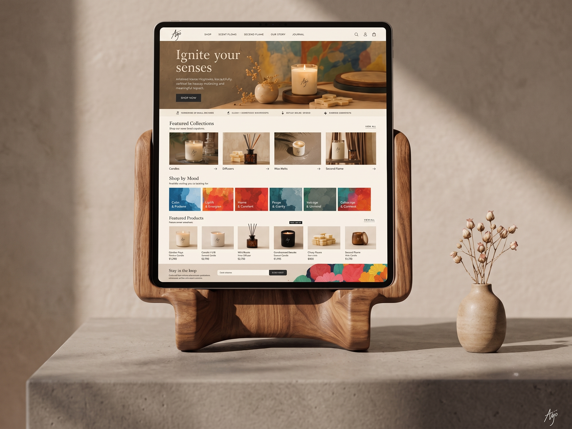
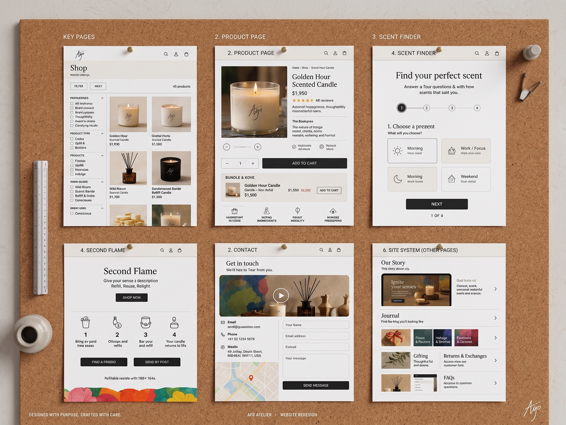
From there, I developed the website's information architecture and UX strategy: a simplified navigation structure, category and product-page templates built for conversion, mood- and occasion-based filtering, and a frictionless checkout with guest purchase, local payment methods, and progress transparency. Conversion features were designed in from the start—bundle builders, complementary product suggestions, customer reviews, a "Scent Finder" quiz for guided discovery, and the "Second Flame" refill programme to drive repeat orders and reinforce sustainability. I also conducted a full audit of the existing site and delivered prioritised recommendations across storytelling, mobile responsiveness, SEO, and performance.
Underpinning the store was the brand foundation I defined in Phase 1—brand story, hero narrative, values, tone of voice, visual communication strategy, and a full marketing mix and content plan—so that the commercial experience stayed emotionally resonant while remaining built to sell.
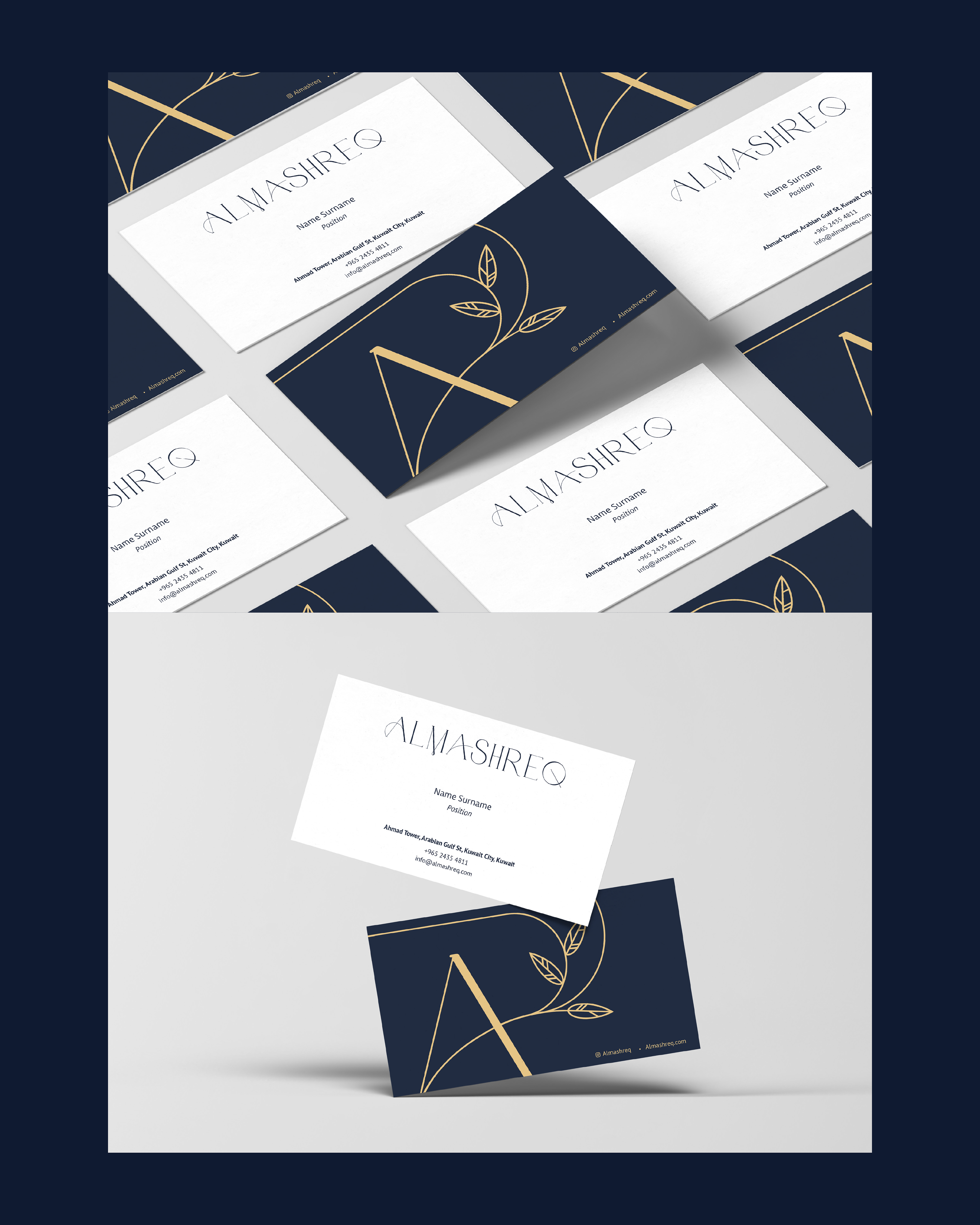
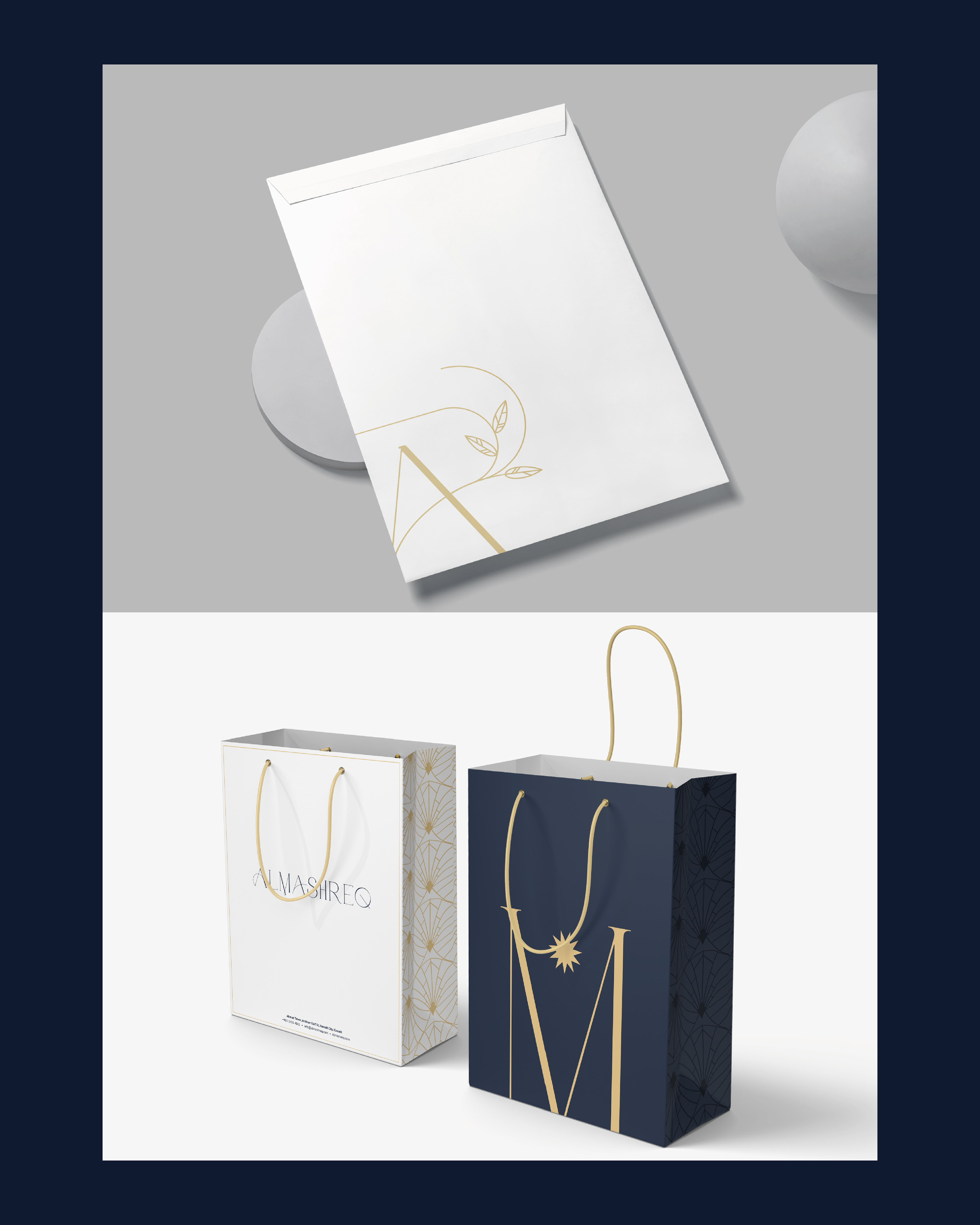
One of the projects I'm most excited to have worked on is the Almashreq Brand Repositioning & Market Entry Strategy. Over several months, I immersed myself in the perfume industry and developed a positioning strategy for specific brands within the Kuwaiti and wider GCC market—work that proved invaluable in defining Almashreq's strengths, guided by the vision of Mr. Tarek Alnassar.
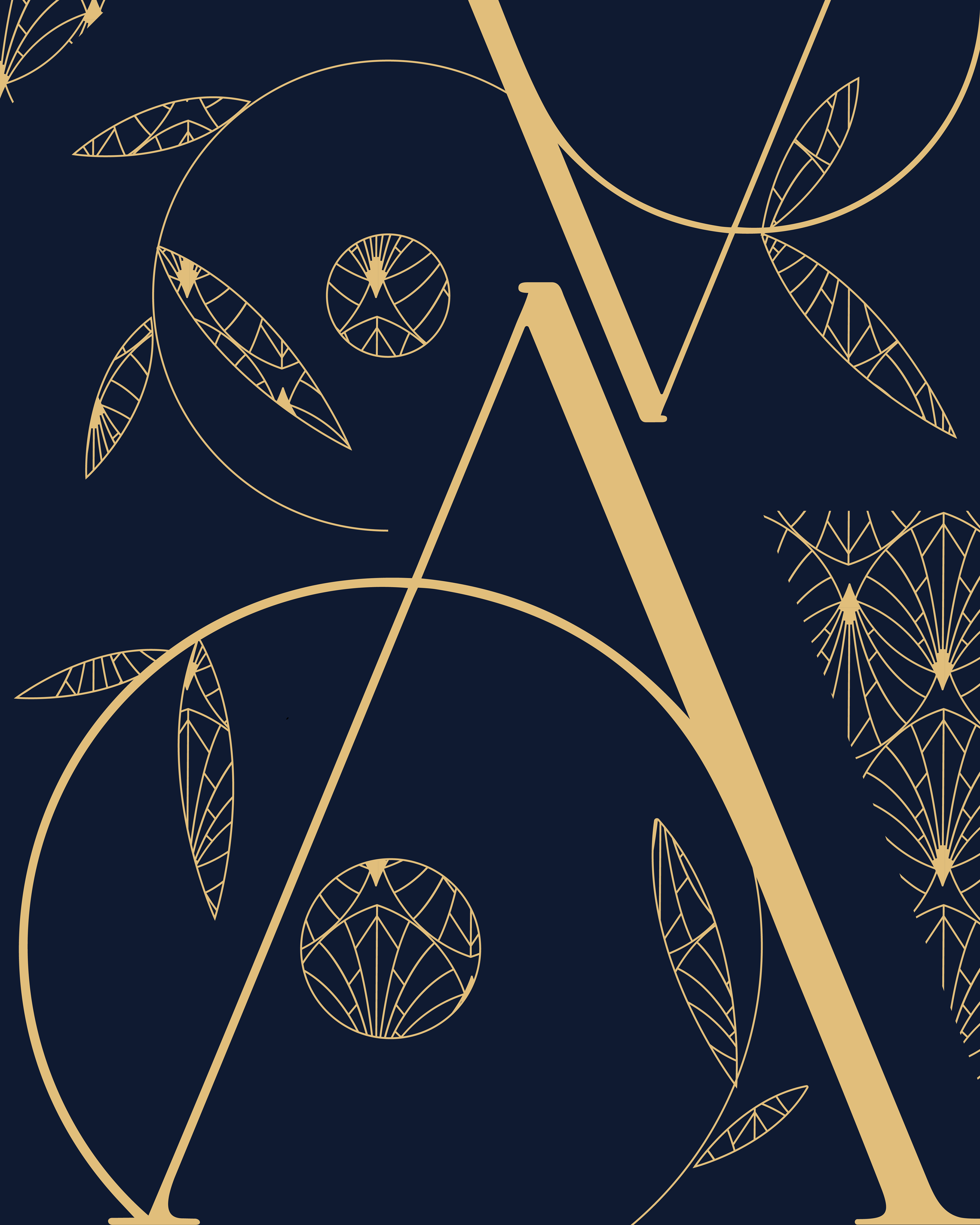
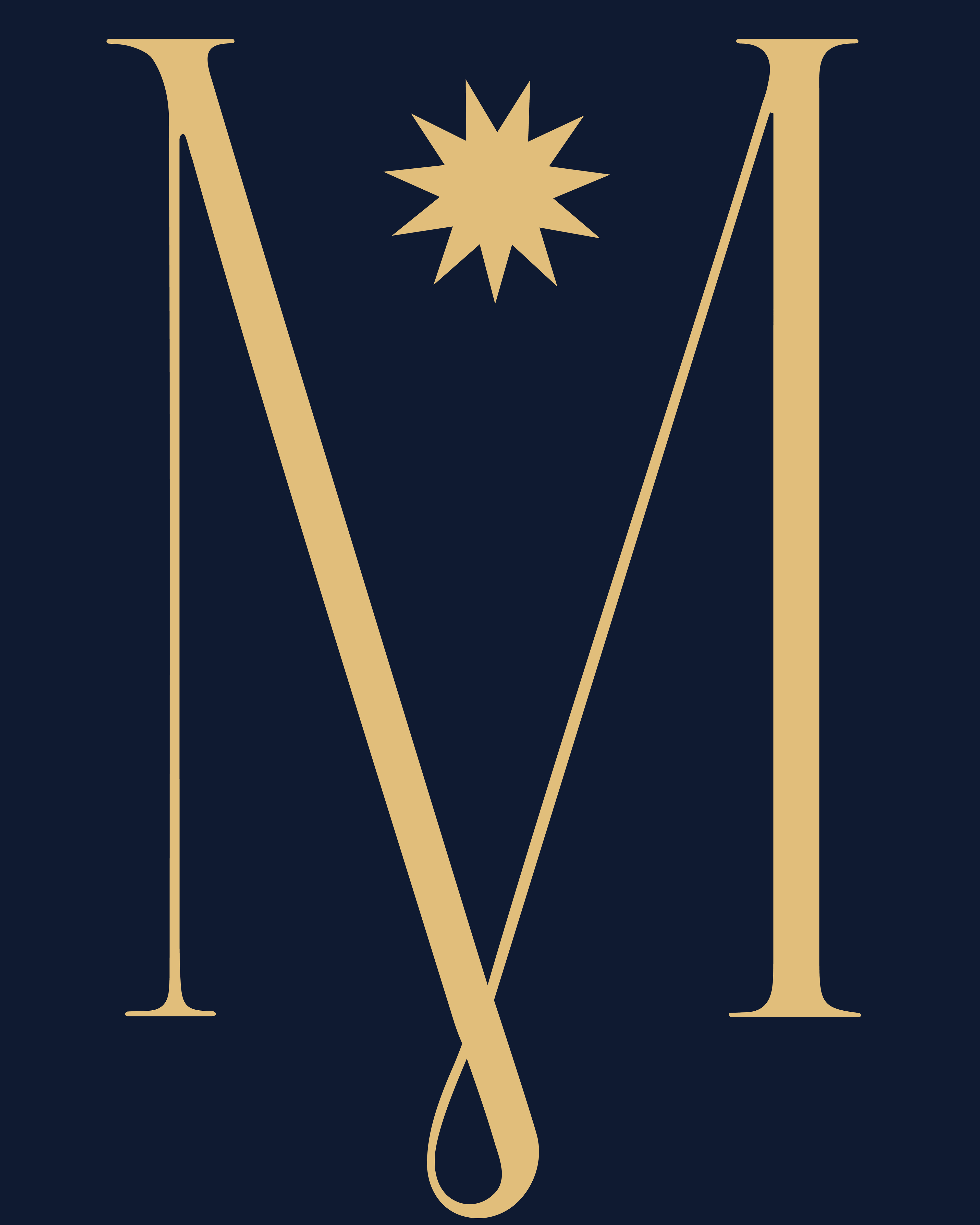
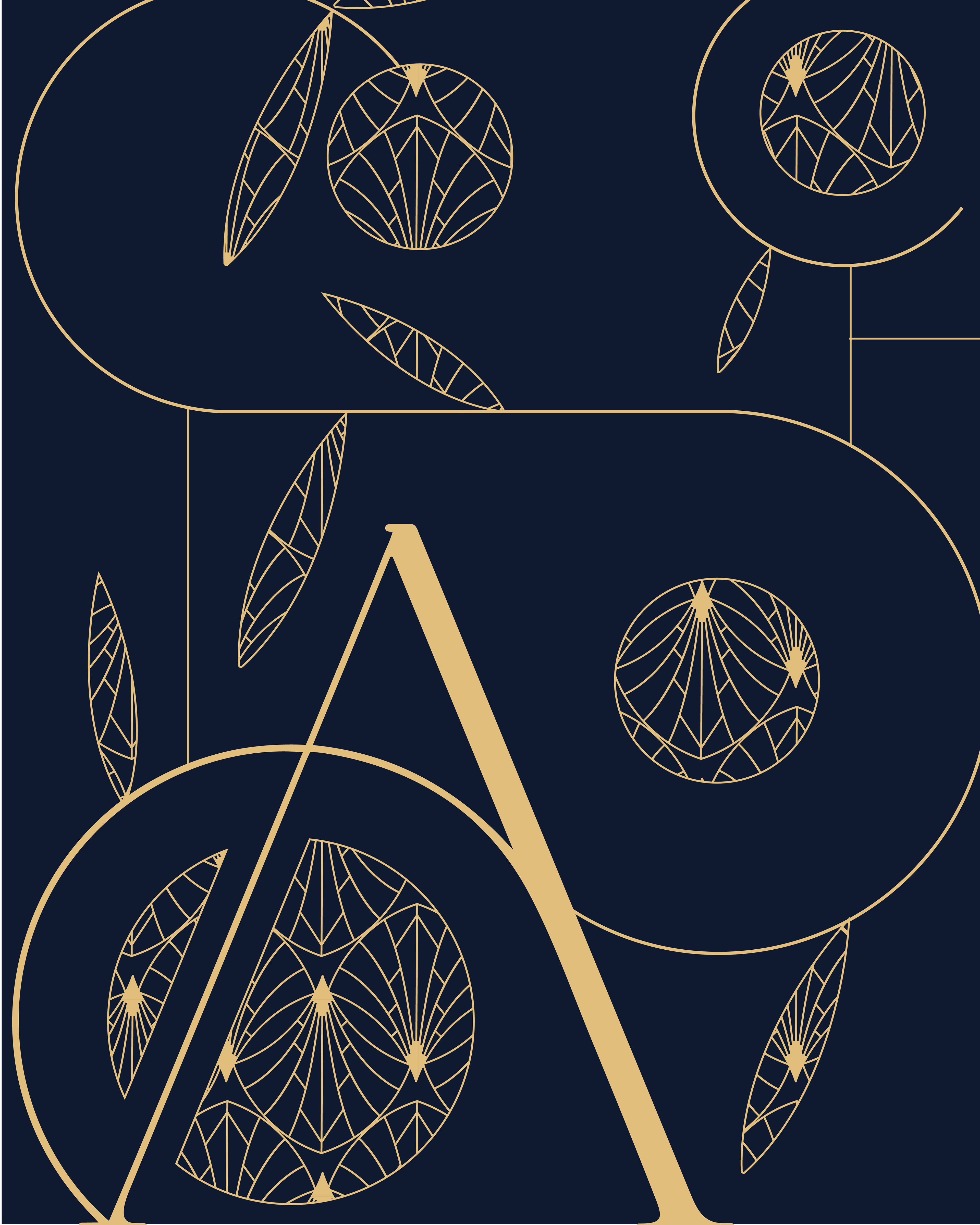
The aim was to infuse a corporate feel while approaching it with a sense of romanticism, kept measured rather than overdone. I drew inspiration from nature—the source of all perfume—and began the brainstorming from indigo blue, a colour that signals royalty, power, and dominance.
We softened this with a touch of gold, lending a luxurious quality befitting a carrier of multiple perfume brands, positioned for growth both locally and across the region. To realise this vision, I collaborated with several designers to achieve the final result.
Al Mashreq Re-branding Project
Graphic Visual Elements
Brand Application
Graphic Visual Element
Brand Application
Graphic Visual Elements
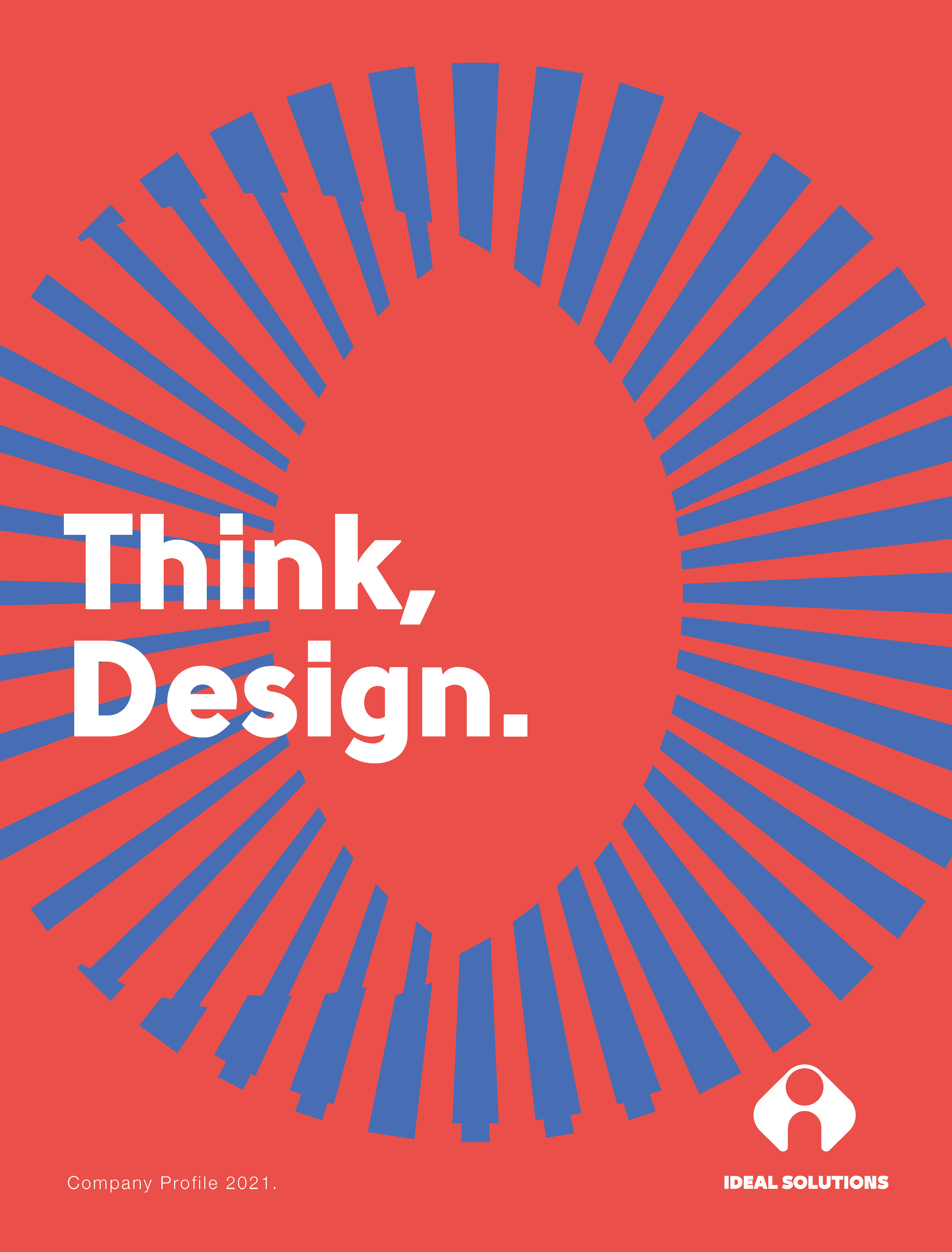
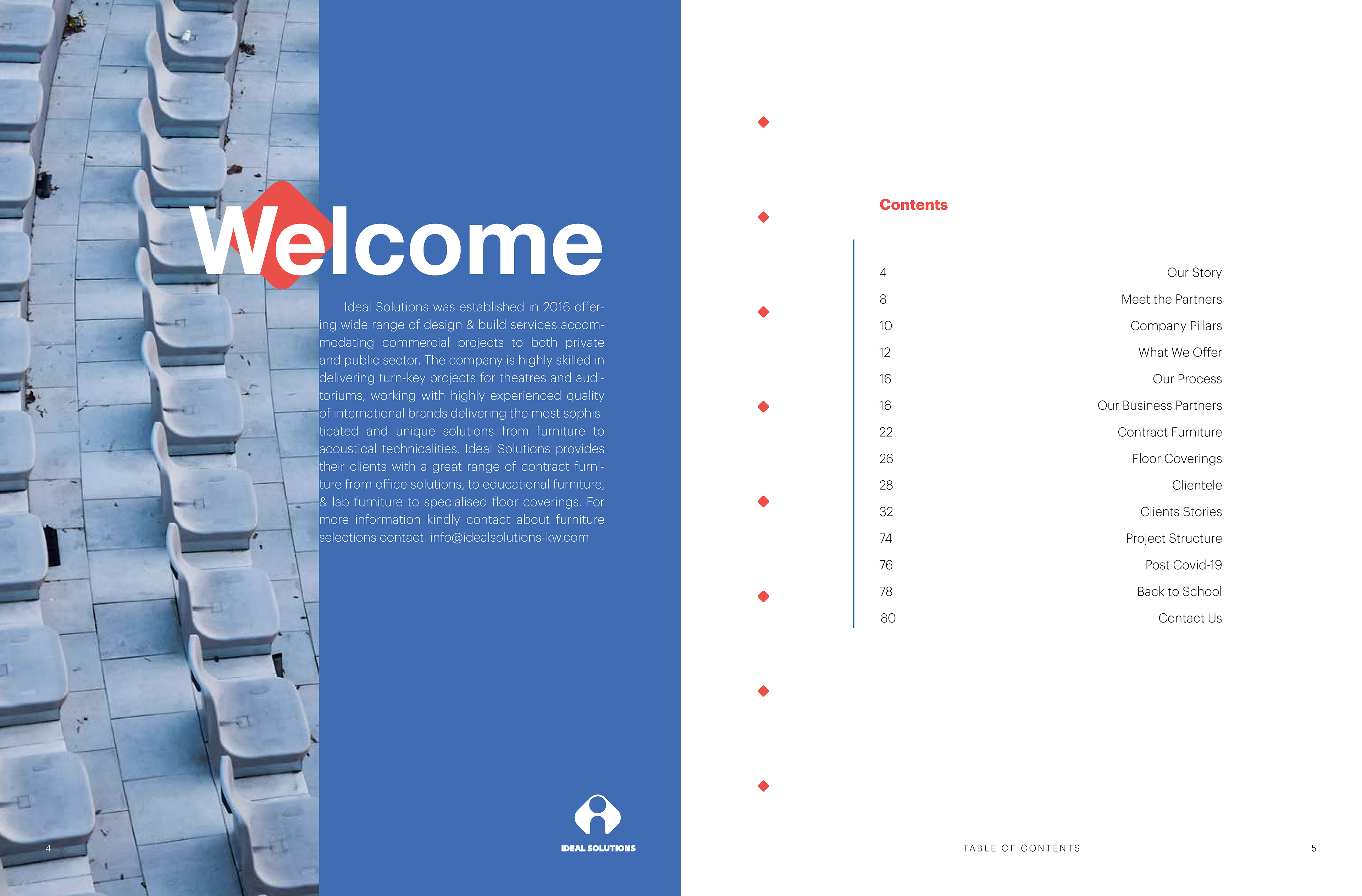
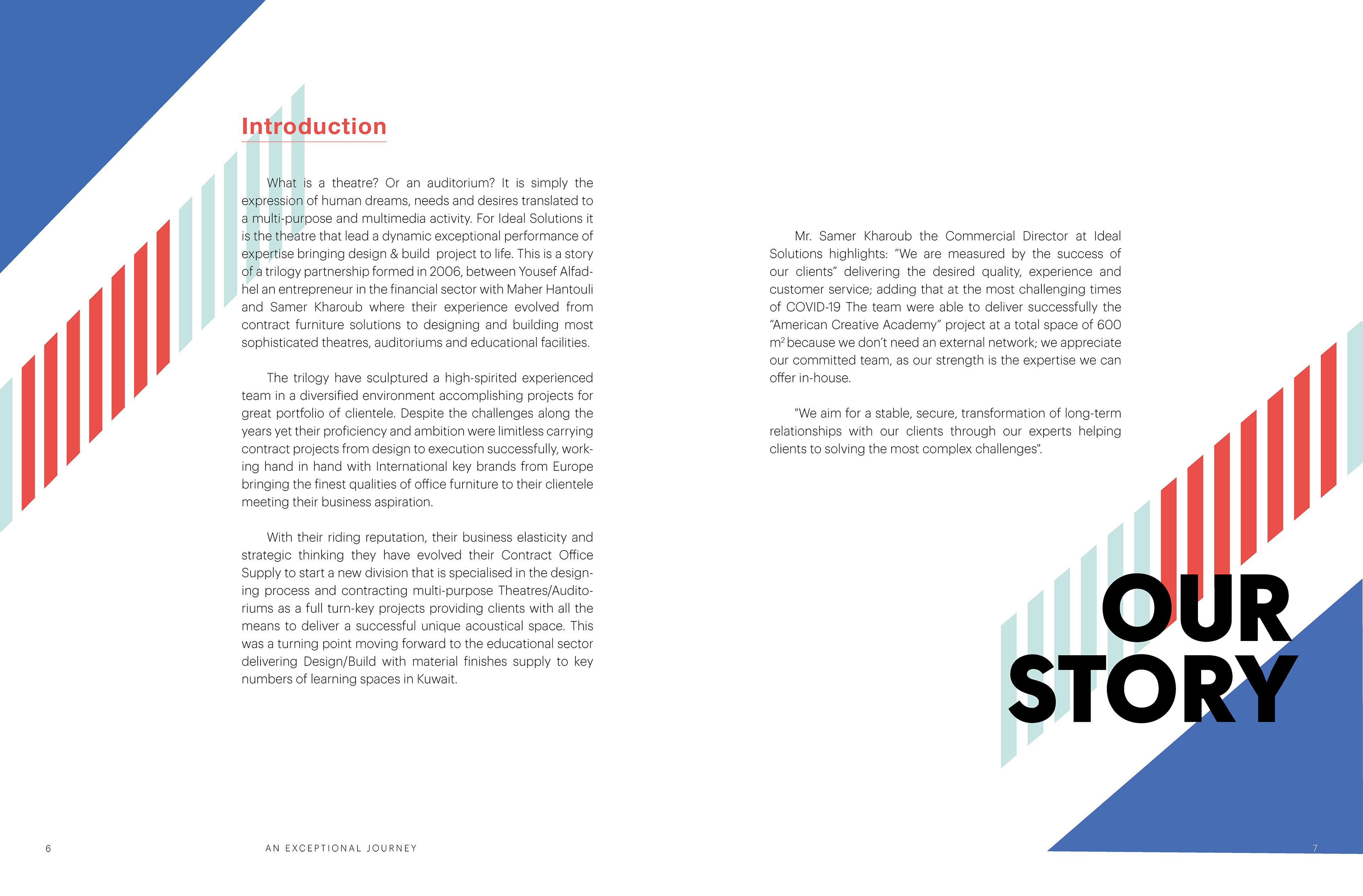
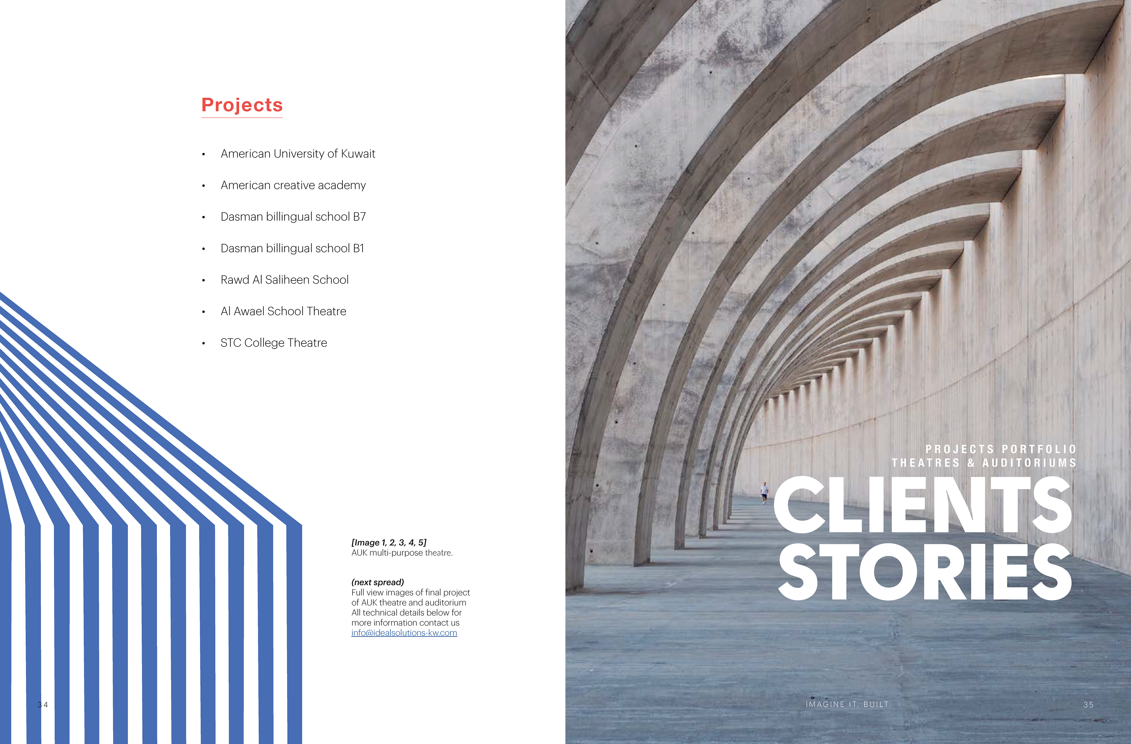
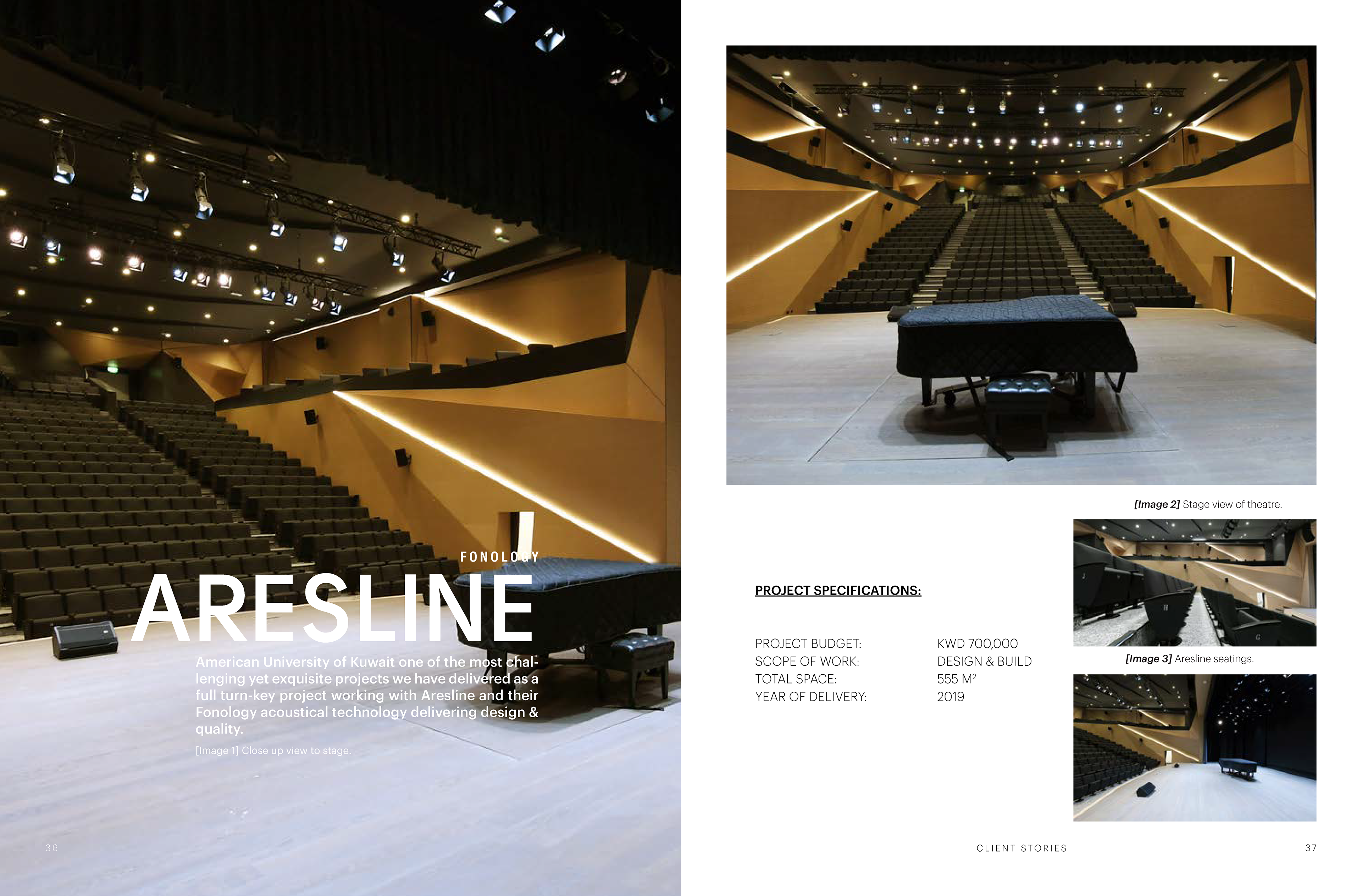
For Ideal Solutions, I led the rebranding strategy in collaboration with designer David Rustom. We built the concept around three narrative pillars—people, information (accuracy), and design—tailored to B2B clients in theatre design and fit-out, auditoriums, and school interior finishes, with a secondary focus on office furniture.
The goal was to position the brand for B2B presentations and public tenders. To anchor the concept, I drew on Roman and Greek theatres, using an abstract floor plan as the central visual element—built to move and animate for a timeless, motion-ready brand.
From there, I moved into the website development and supervision, along with the customer experience and UI design—all done manually.
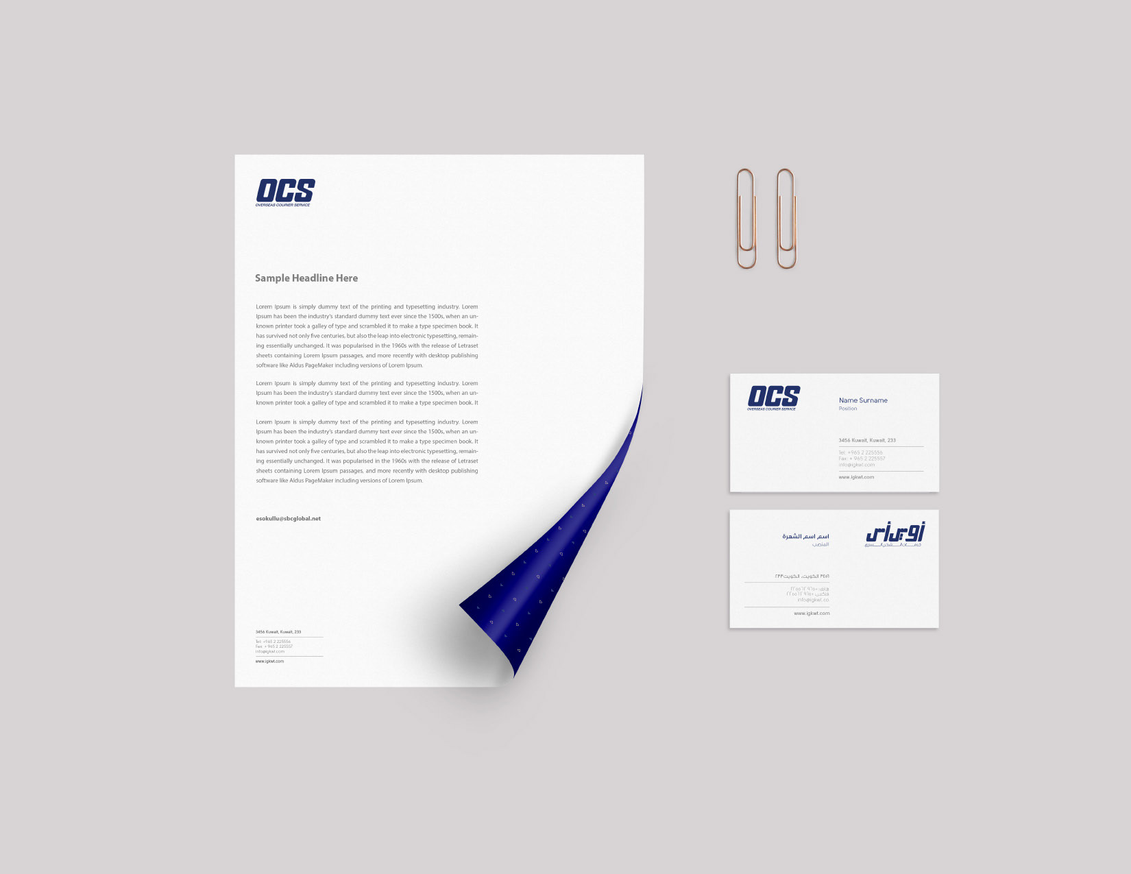
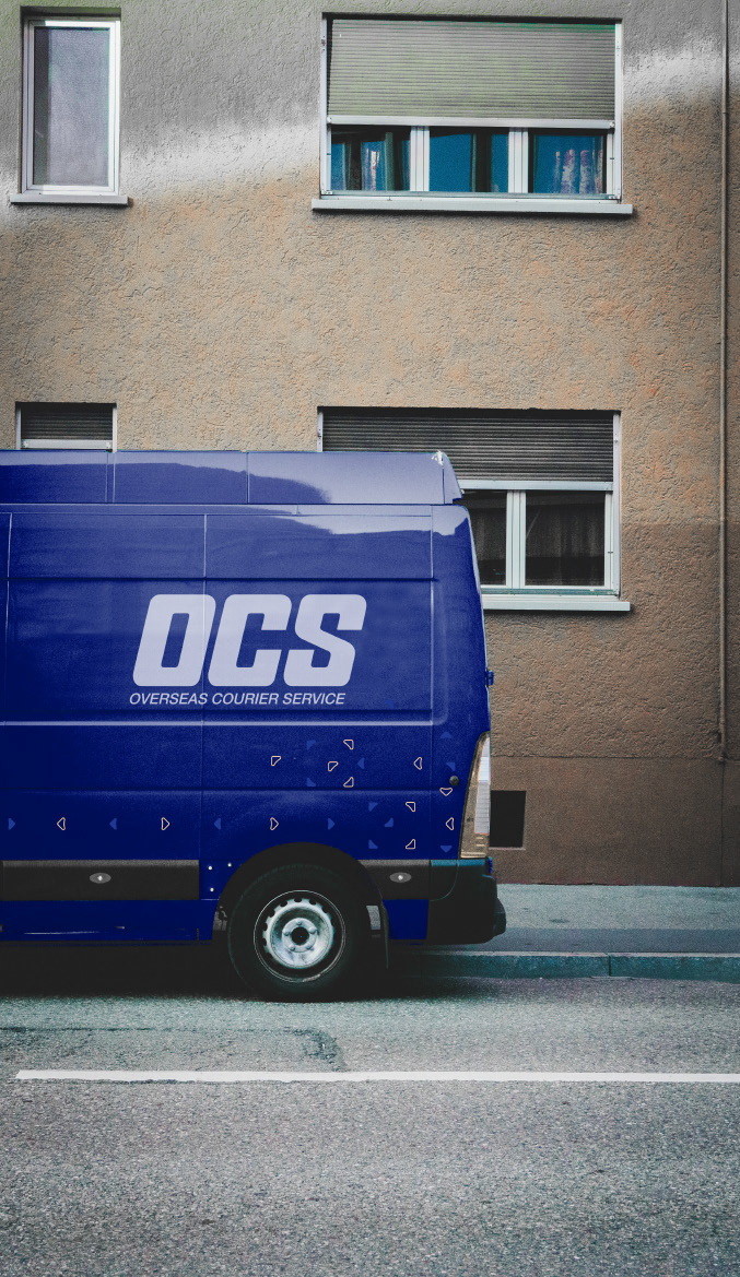
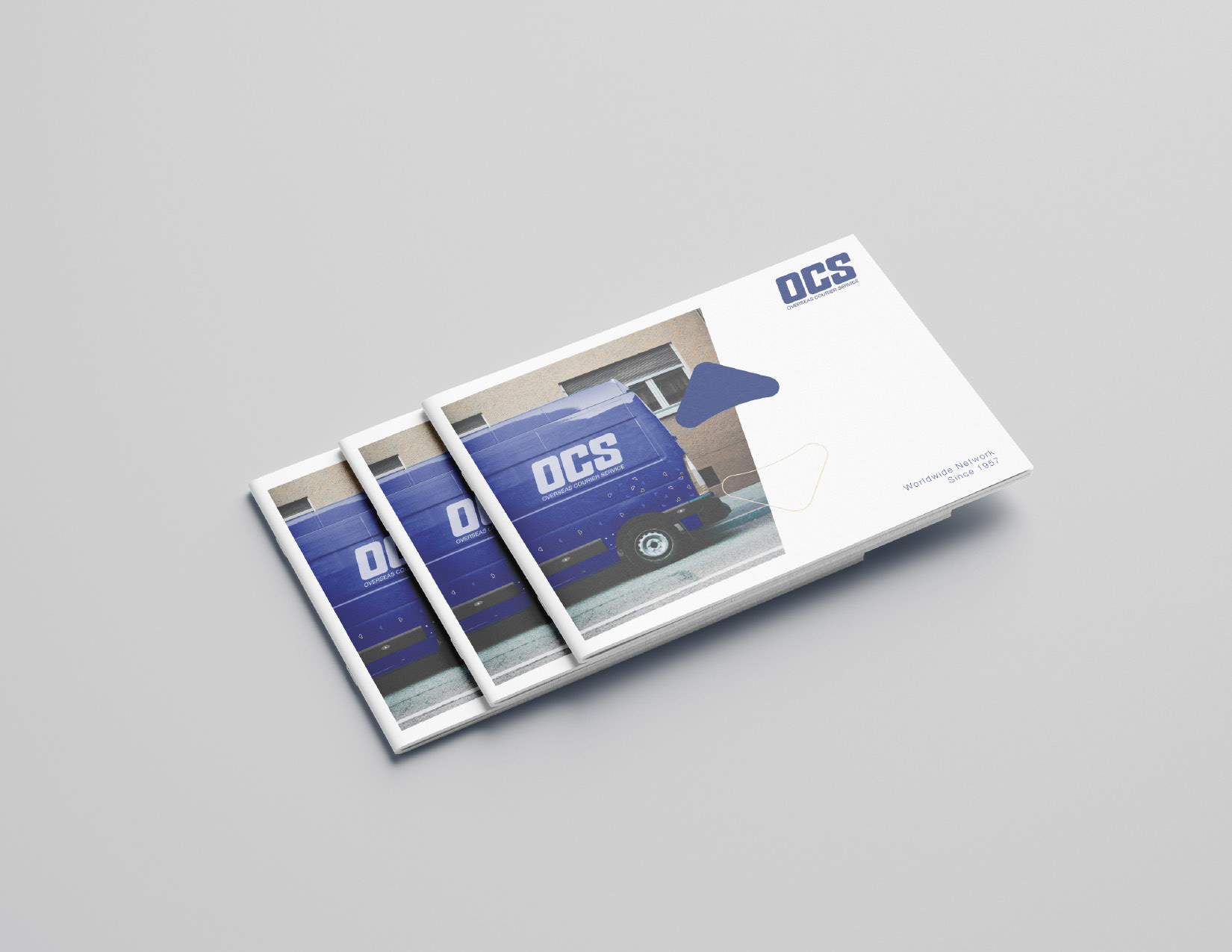
I worked on the OCS – Kuwait Branch project, rearranging the brand assets for their launch into the market. It was an honour to work alongside Mr. Khaled Alghamin, who led the project as CEO. Together with designer David Rustom, I focused on localising the brand into Arabic—redrawing the letterforms to match and complement the English typography. We also designed the full suite of marketing collaterals required to support the branding rollout.
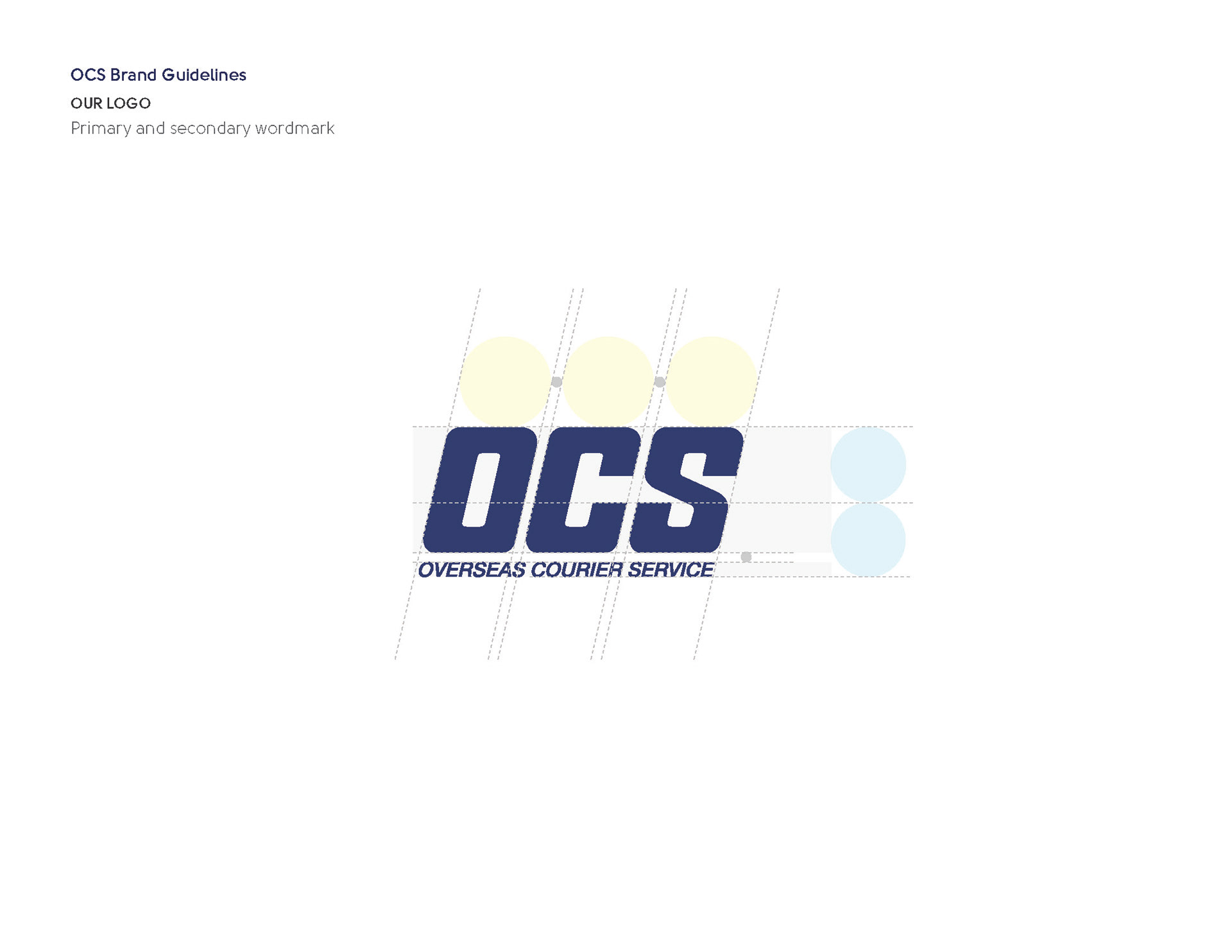
OCS Logo Guide Adjustment
Brand Adaptation & Application
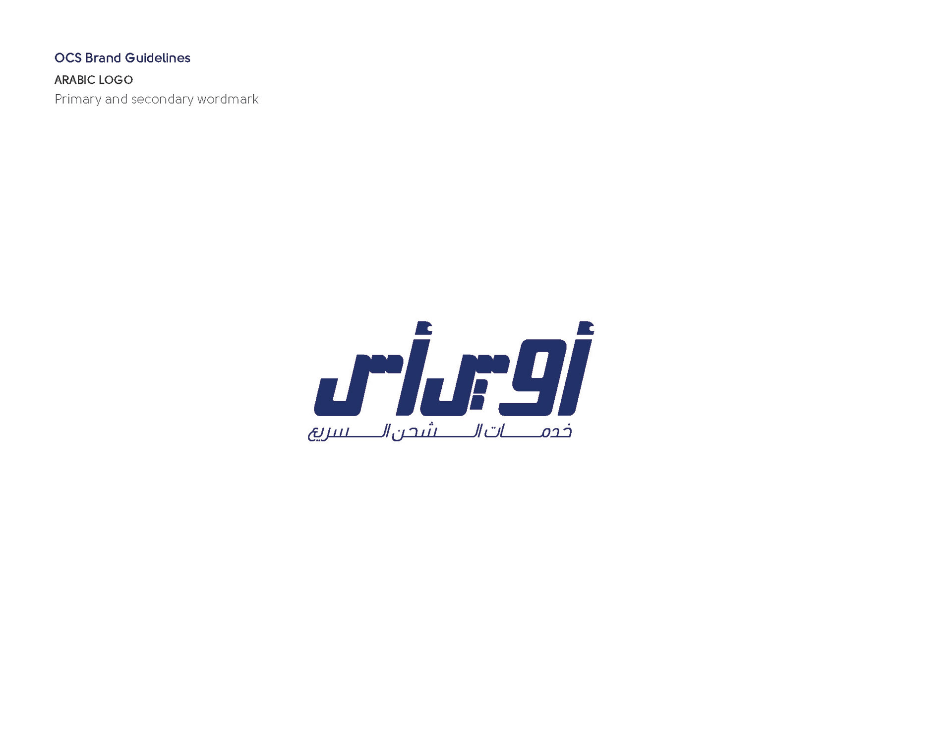
Design an Arabic Logo
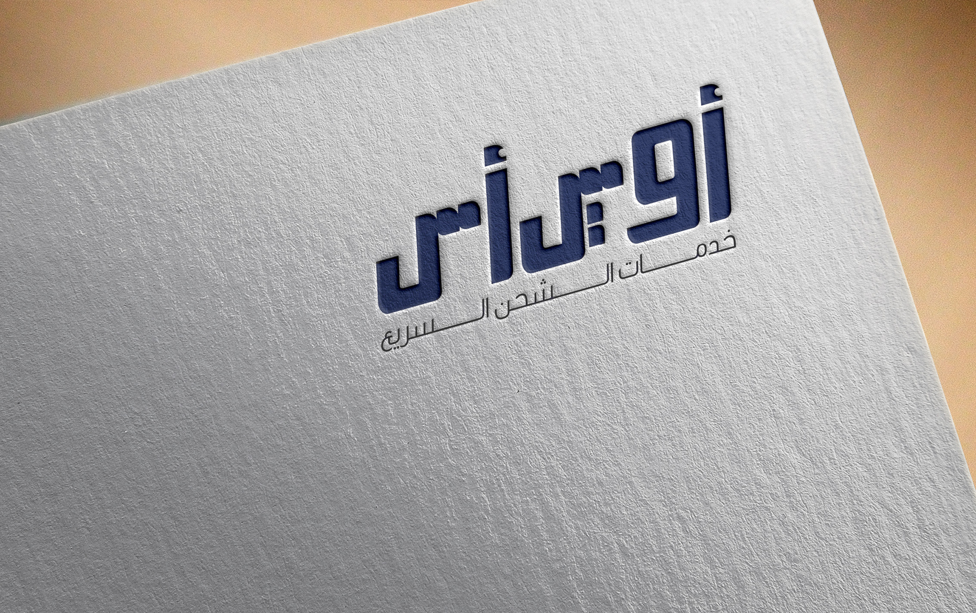
Arabic Logo Application
Brand Application
Brand Application
Brand Application
Brand Application
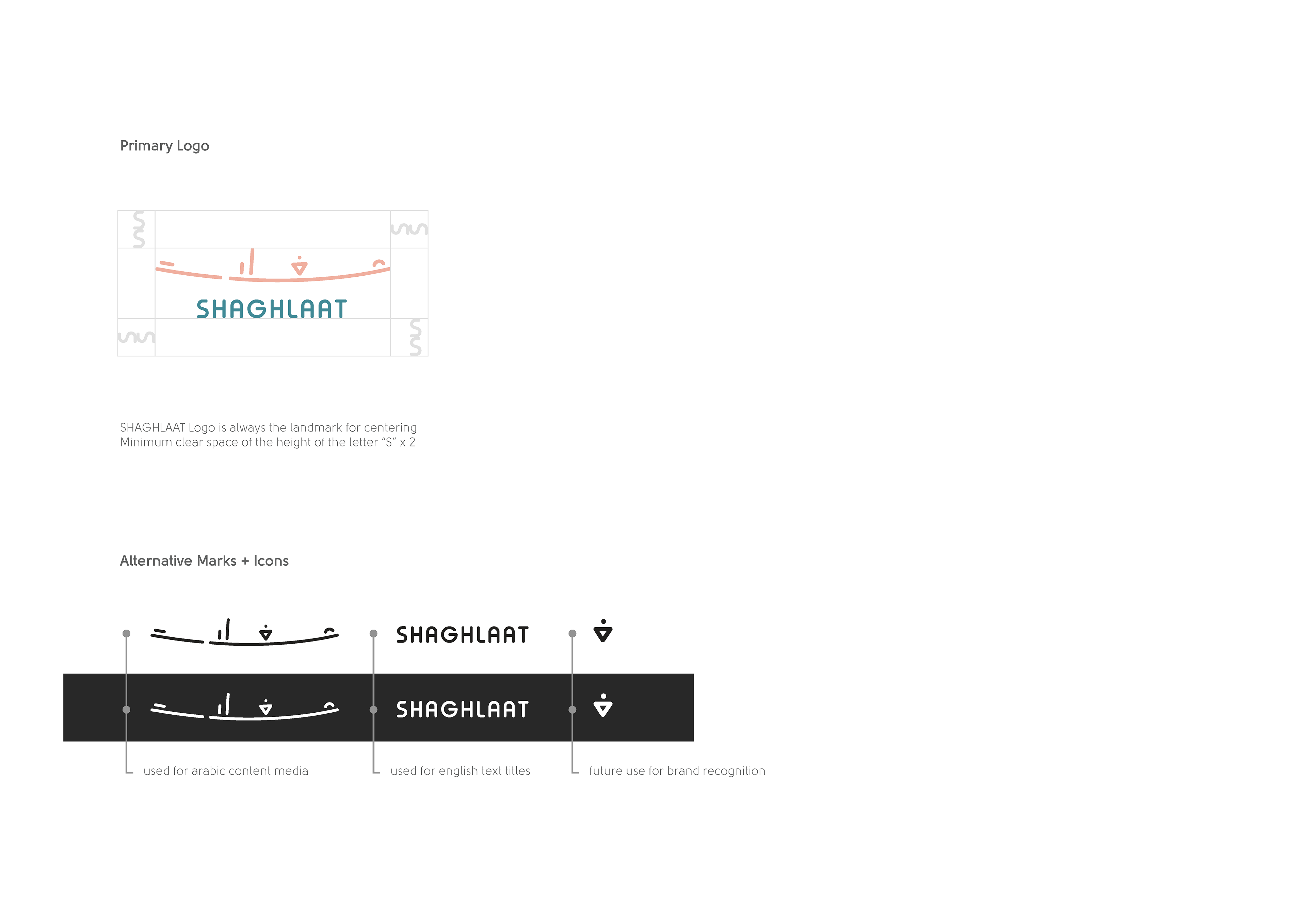
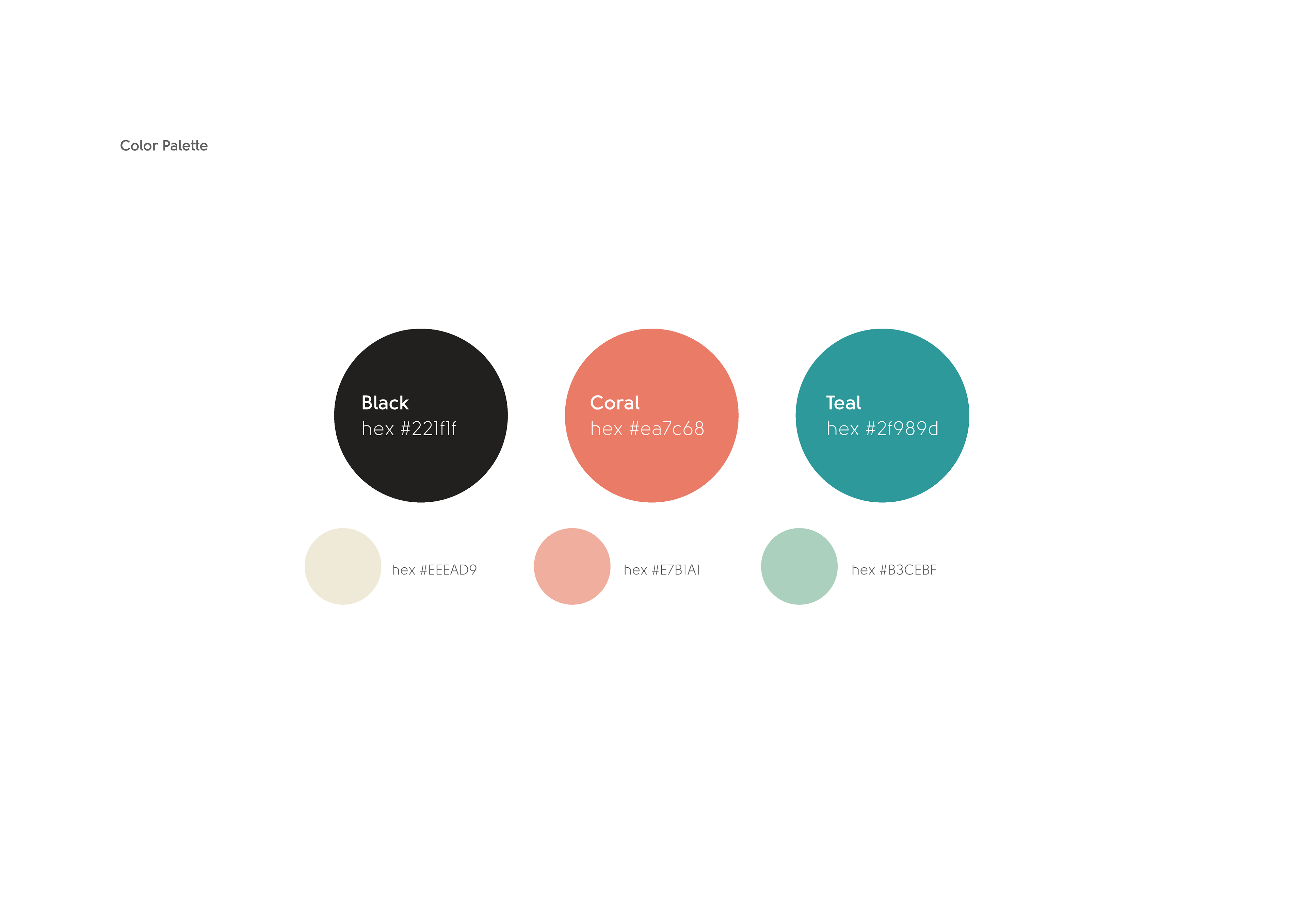
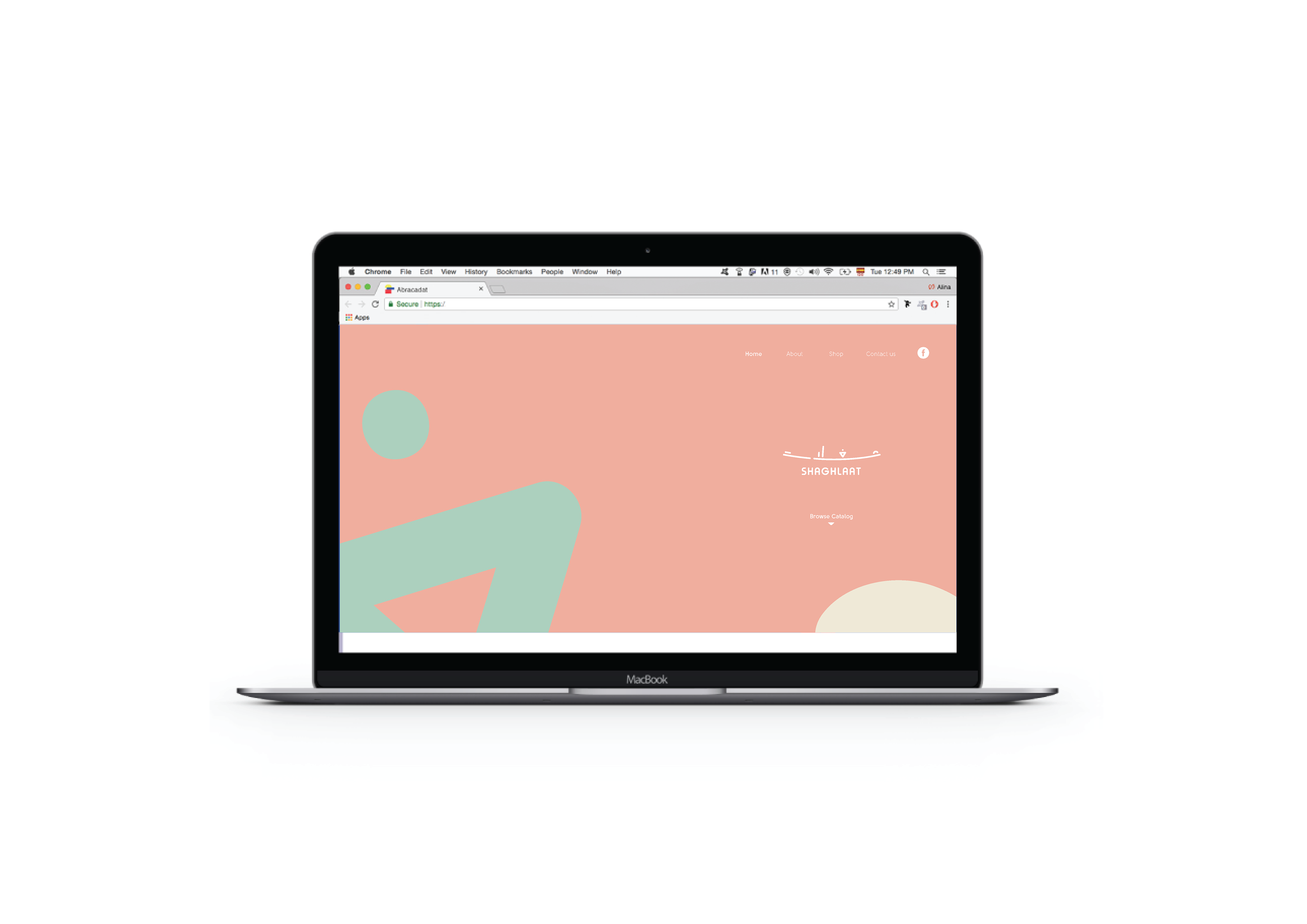
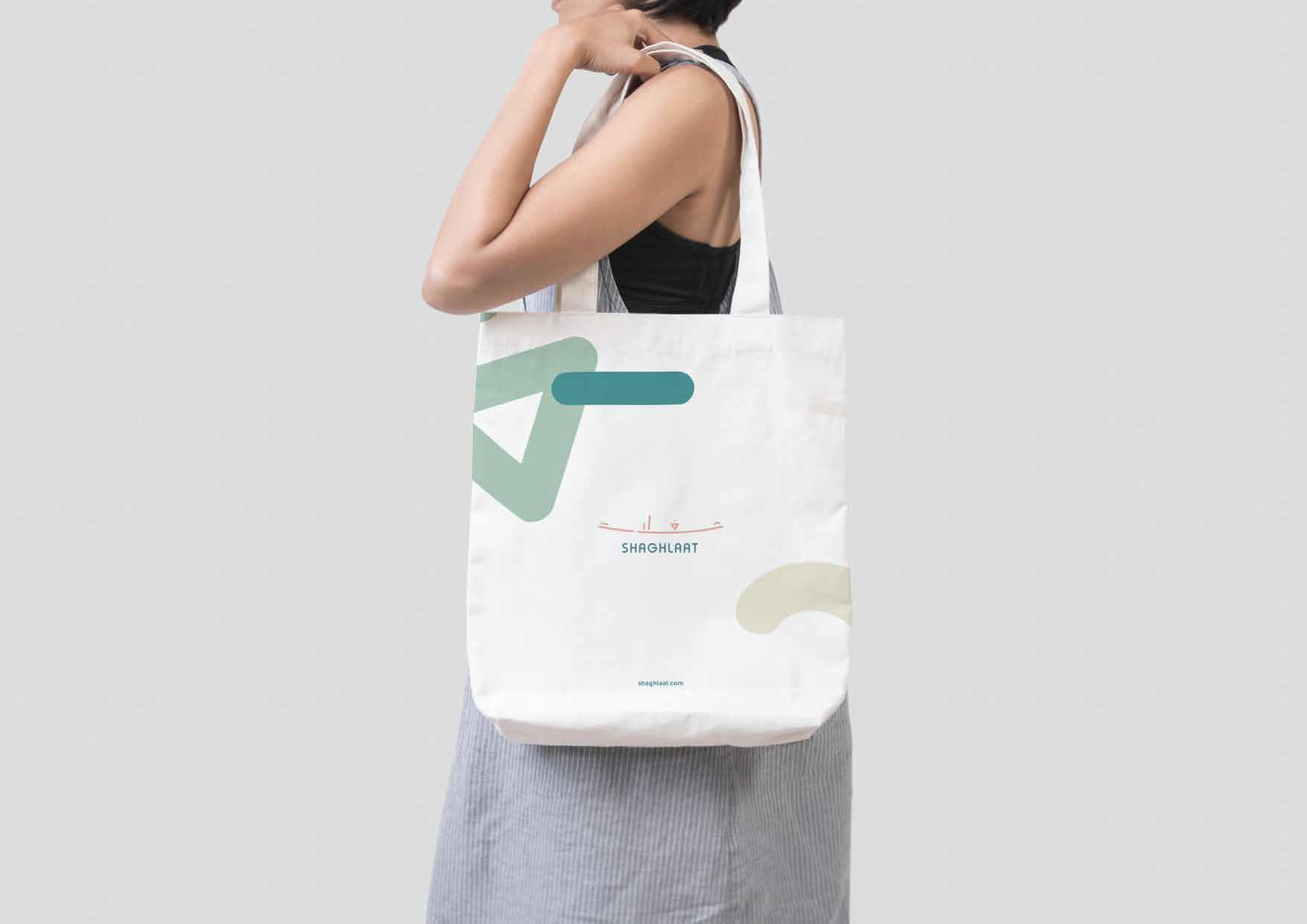
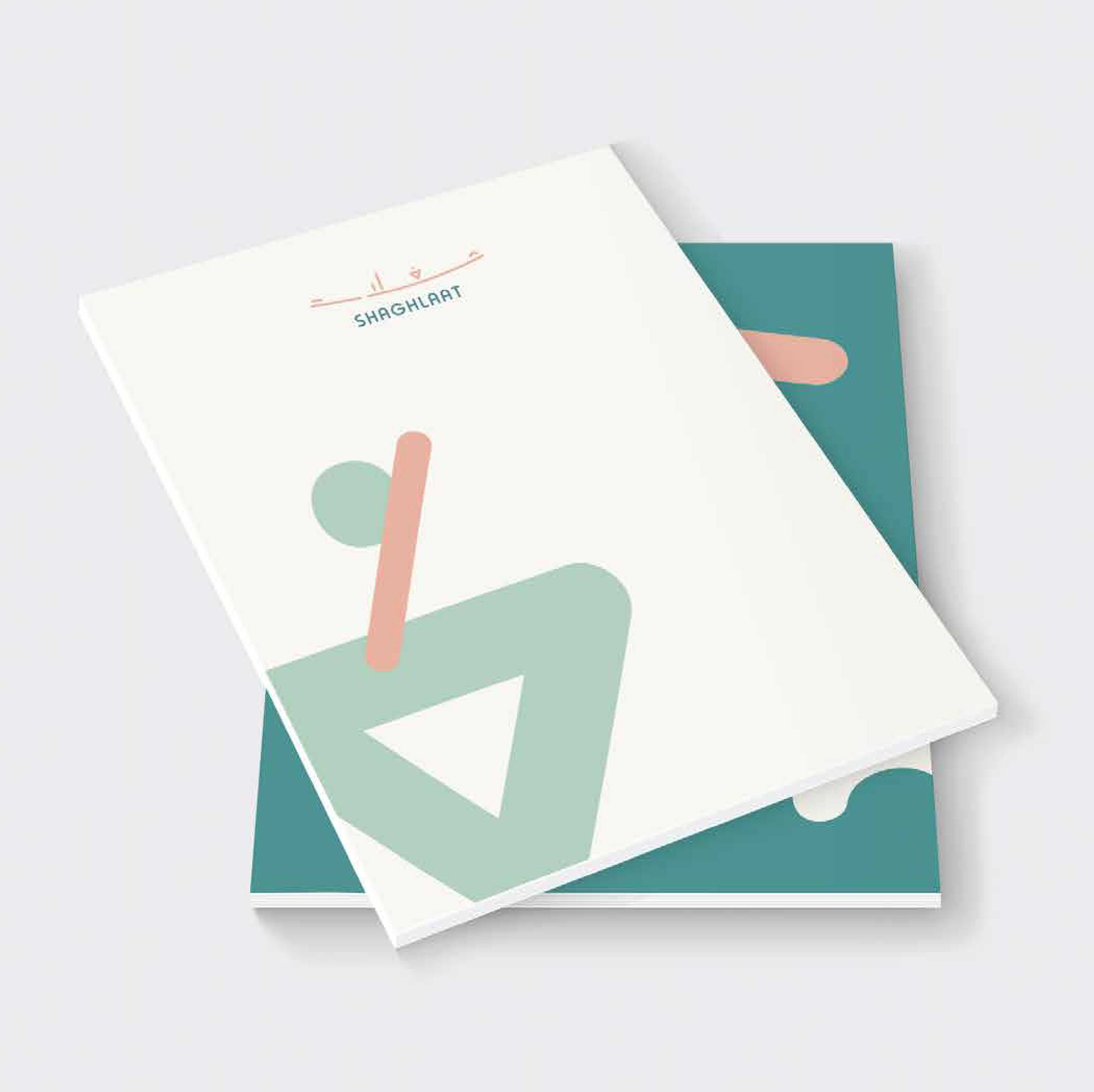
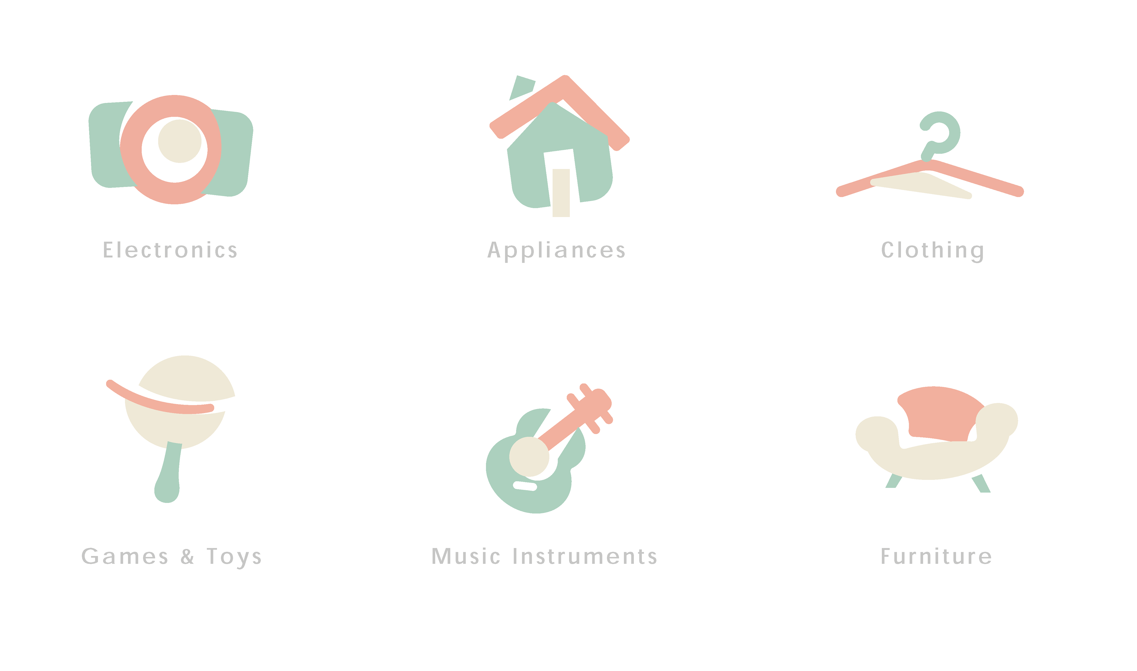
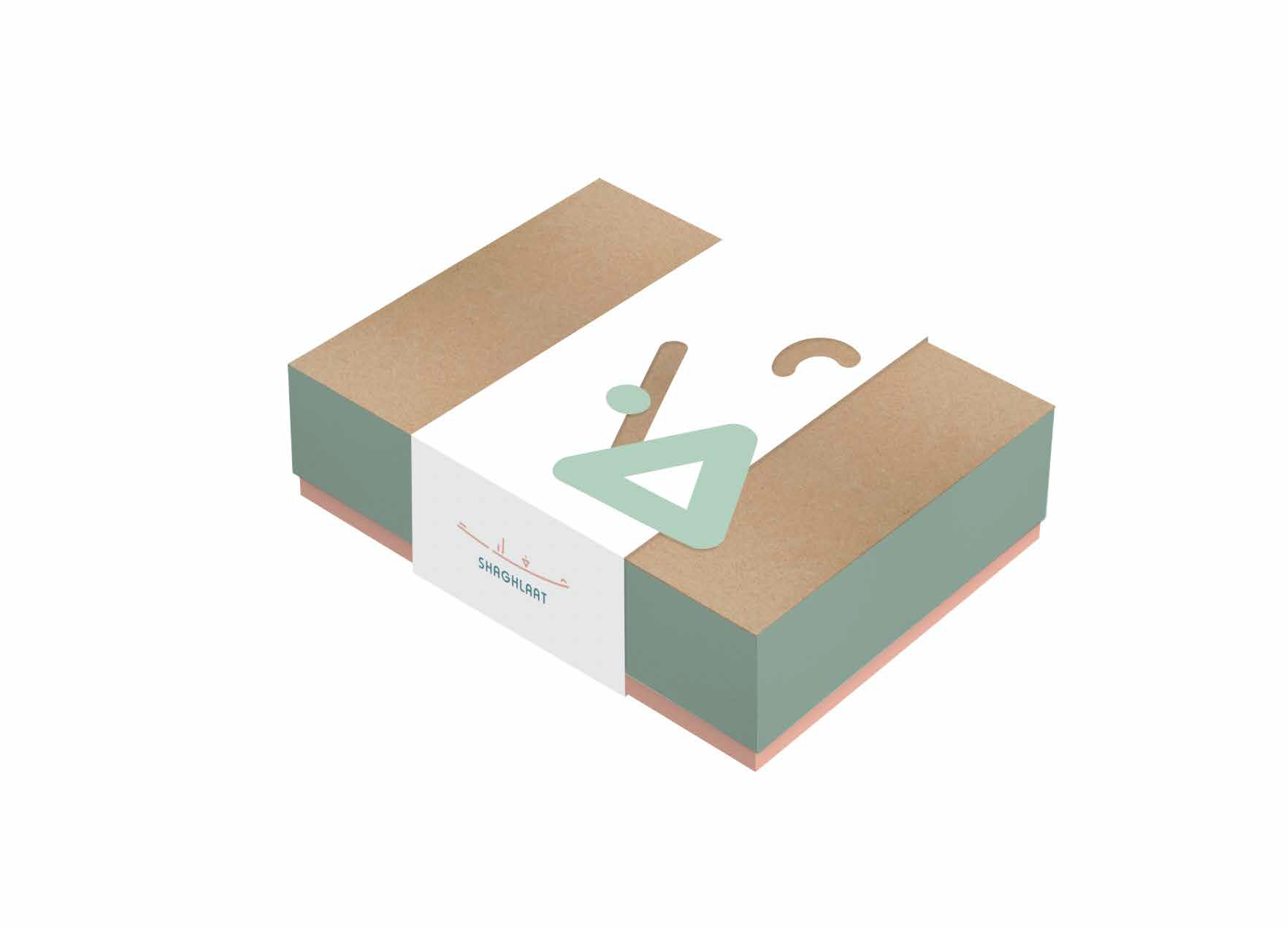
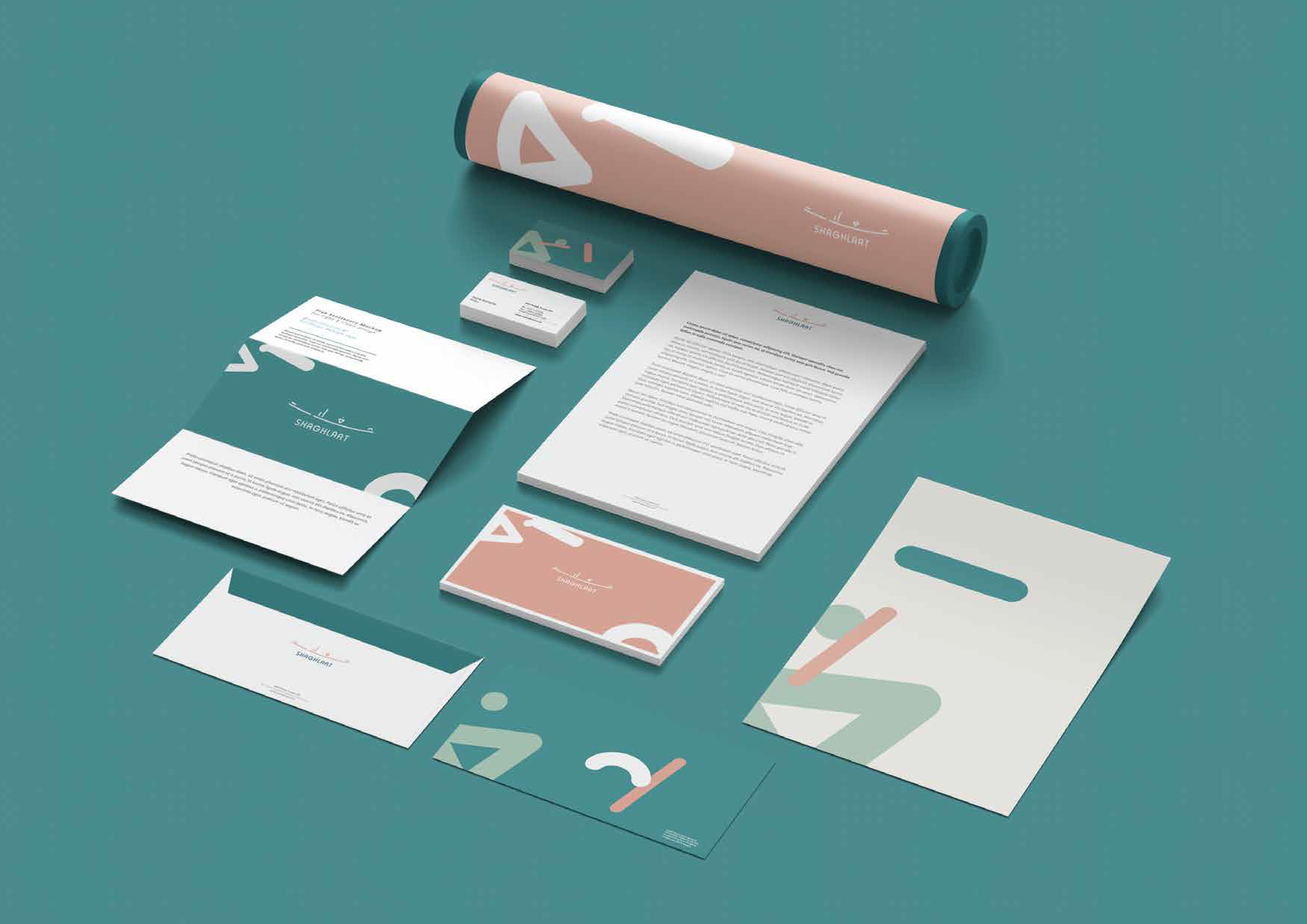
For SHAGHLAAT, I developed the branding for an e-commerce platform spanning multiple product categories—electronics, appliances, and clothing. The identity was built to feel playful and approachable while staying versatile enough to carry a broad retail offering. At its heart is a set of abstract human figures constructed from simple geometric shapes, giving the brand a friendly, energetic character that translates easily across digital and print.
I extended the system across a full suite of touch points: the website interface, category iconography, packaging, tote bags, and stationery—creating a cohesive, recognisable experience from first click to final delivery.
Branding Strategy Project

Graphic Visual Element
Brand Colours

Graphic Visual Elements
Adaption
Brand Application
Brand Application
Brand Graphics
Brand Packaging
Brand Applications
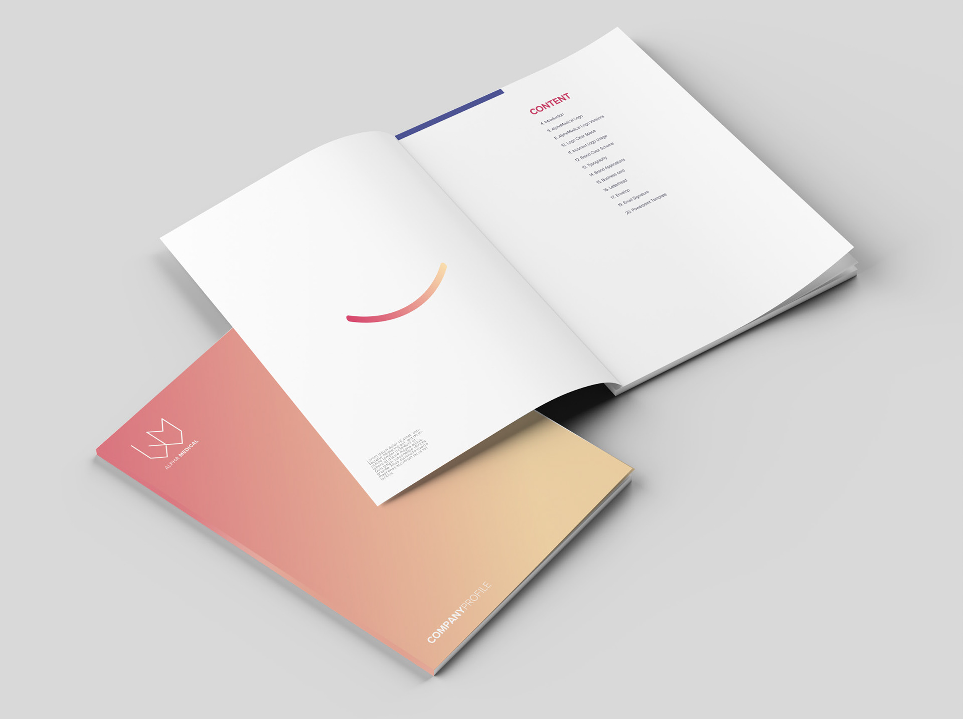
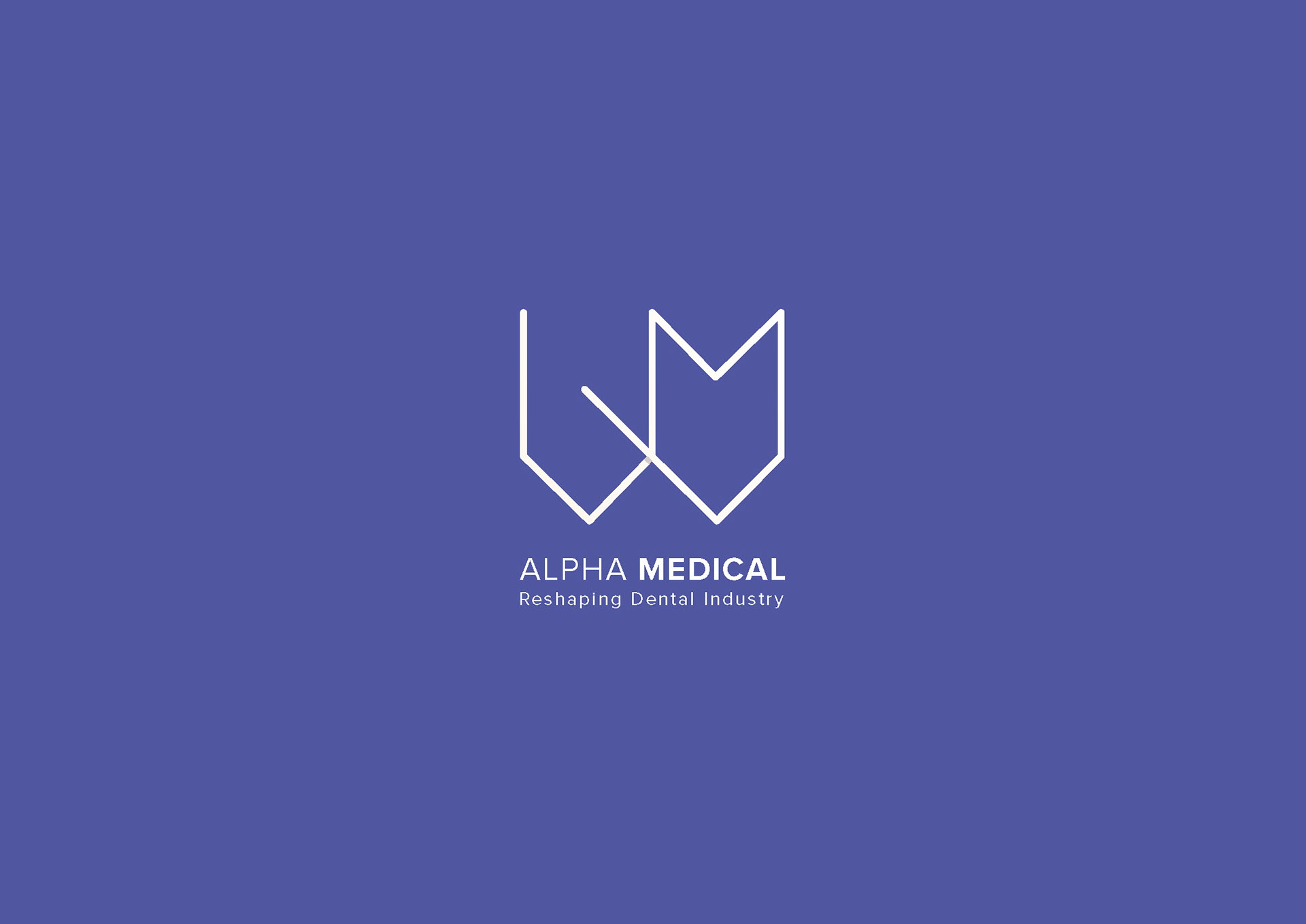
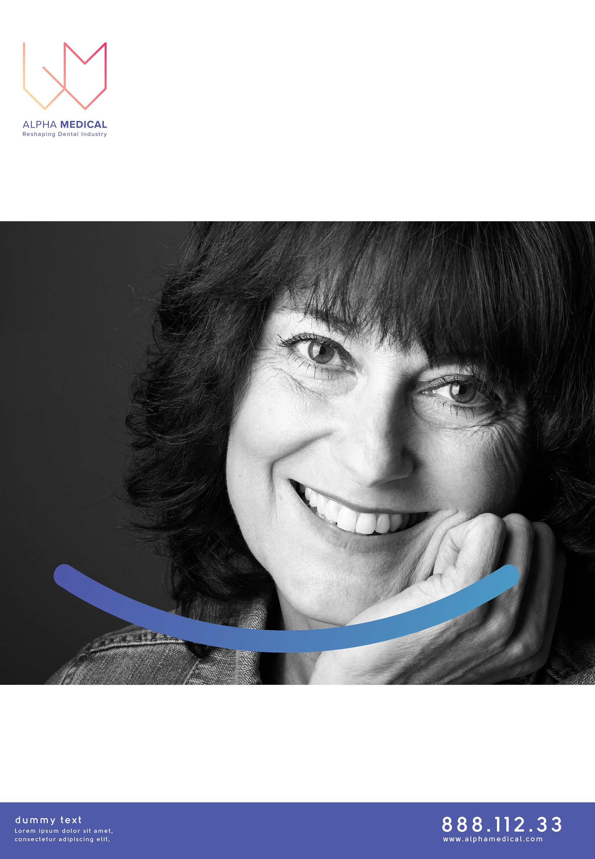
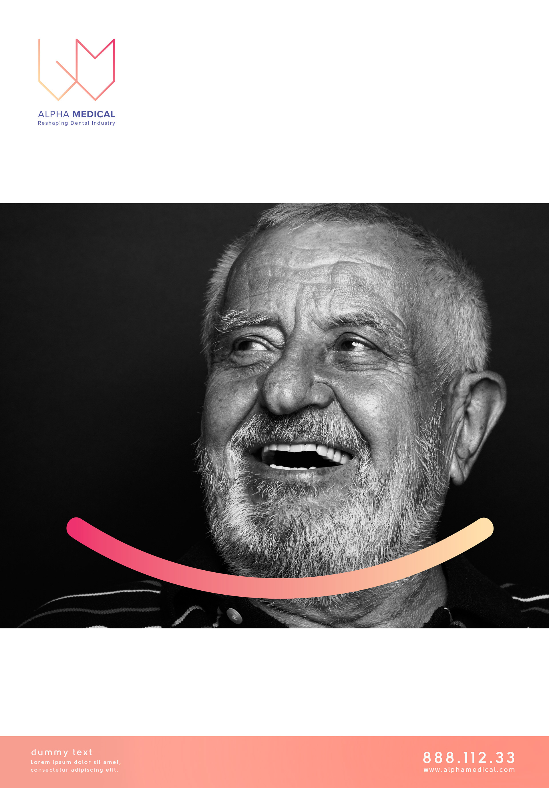
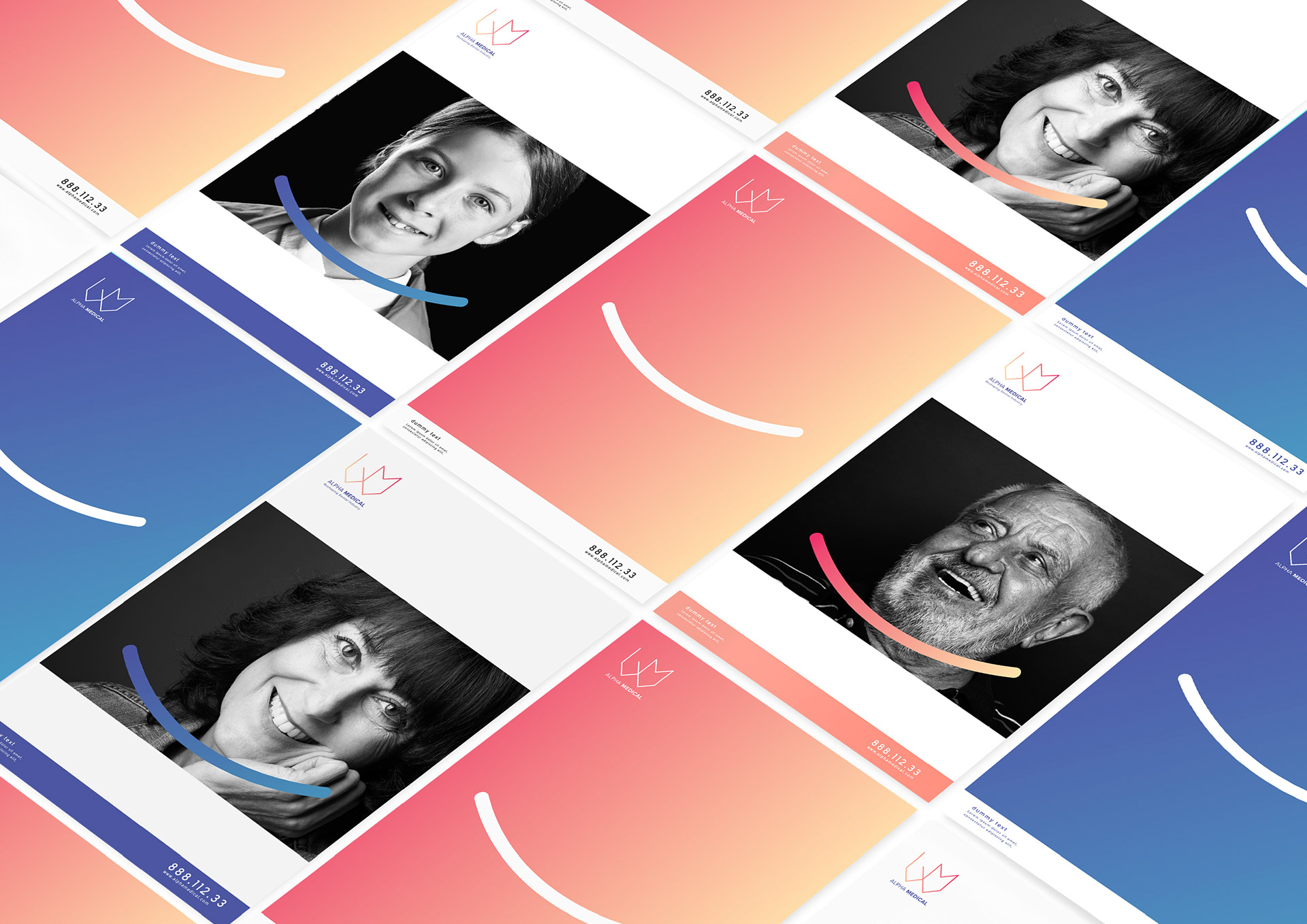
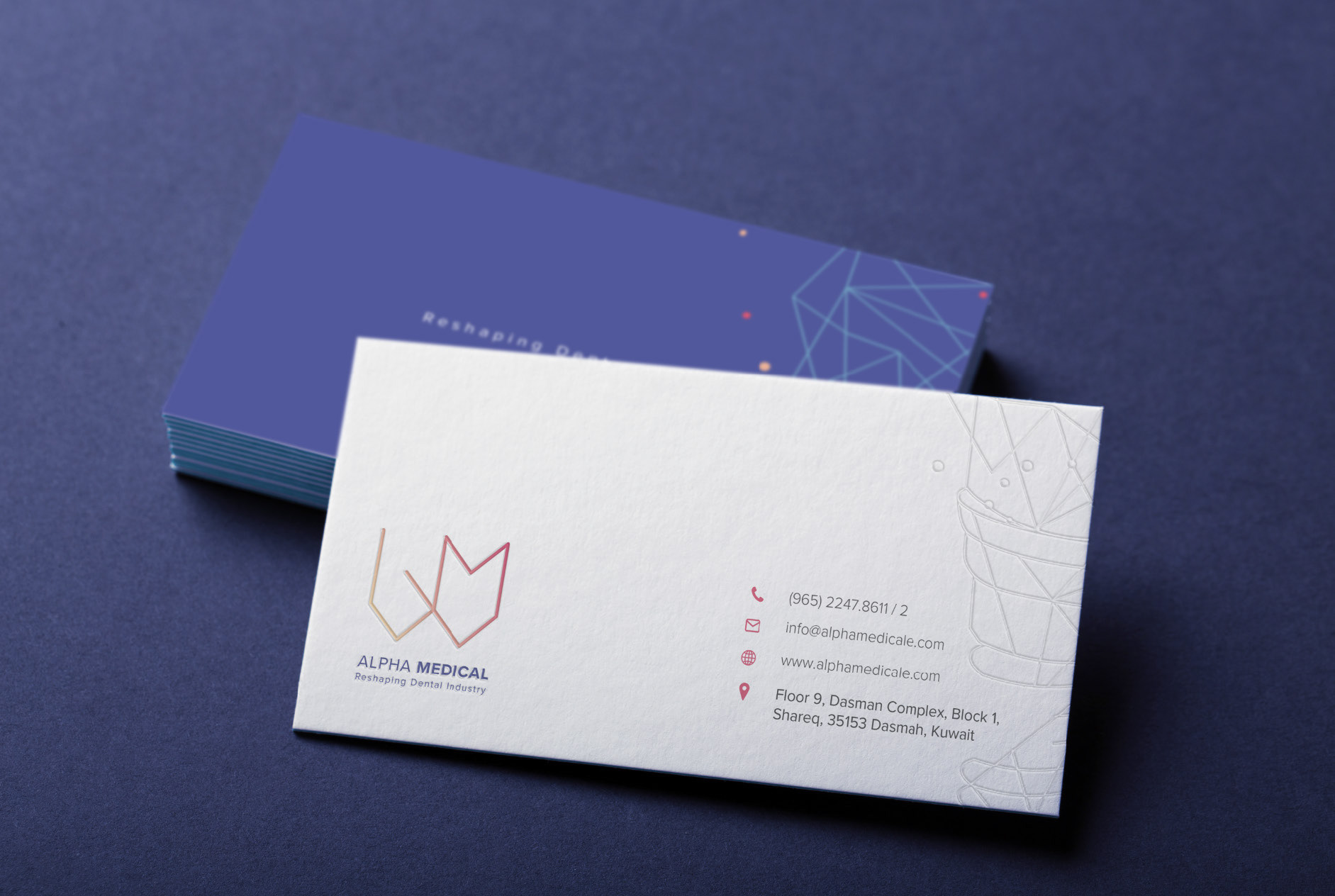
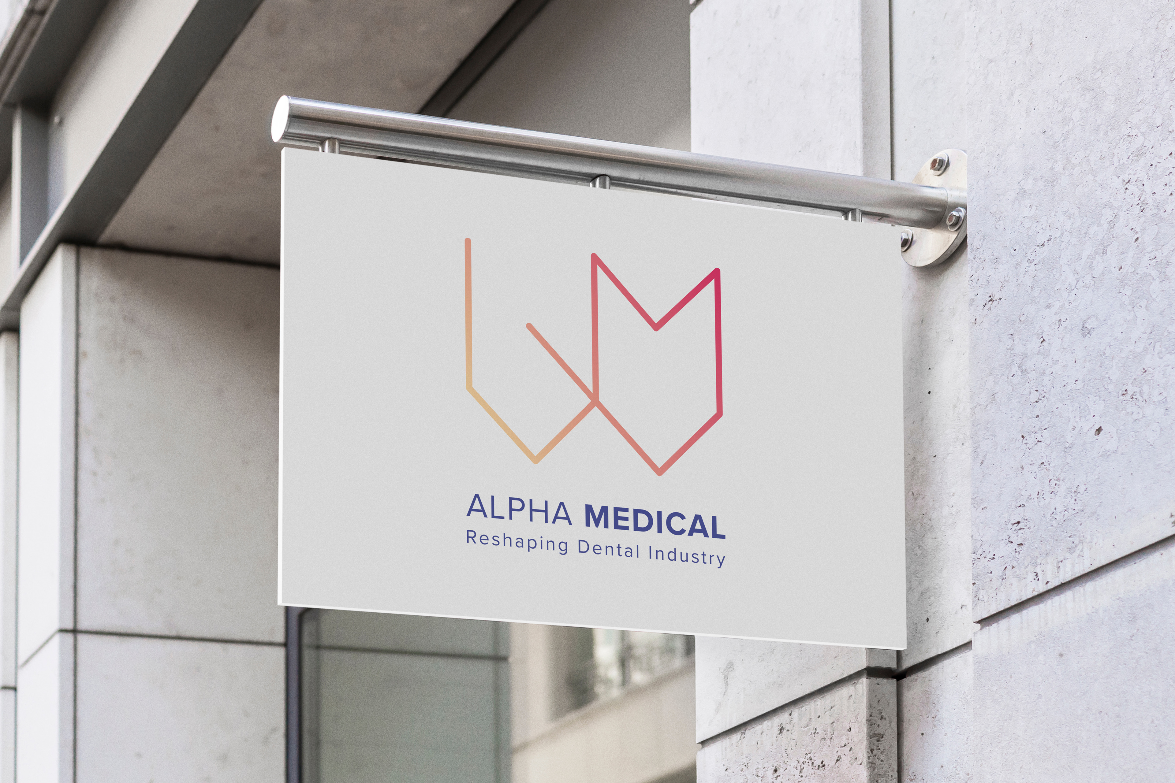
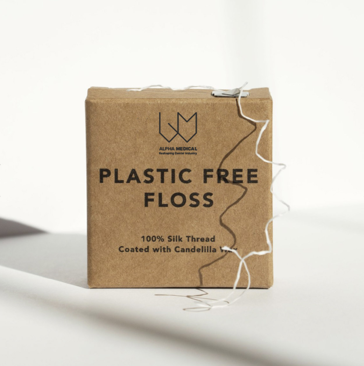
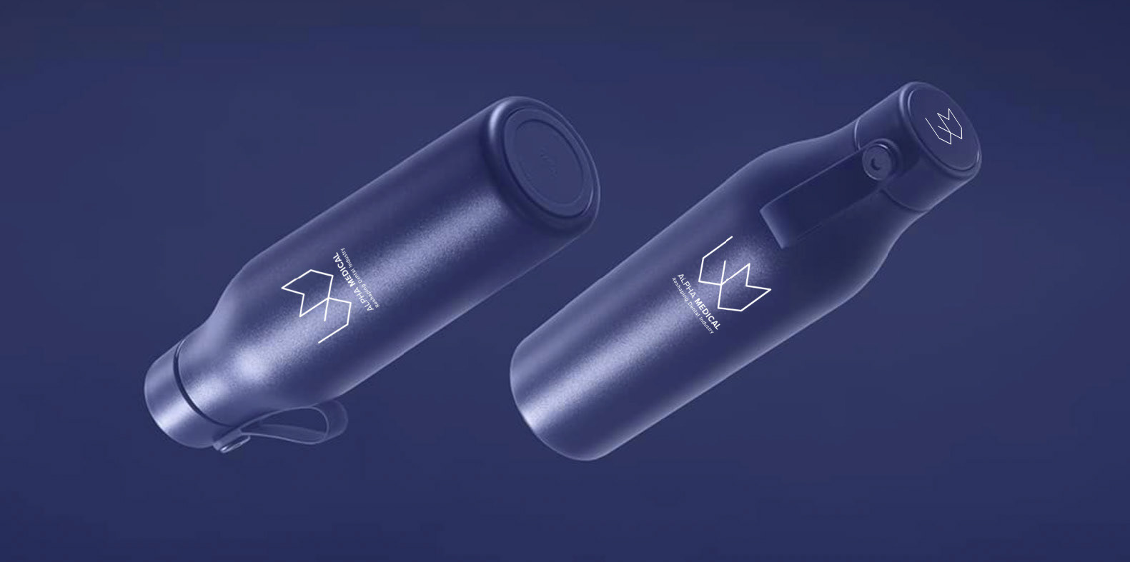
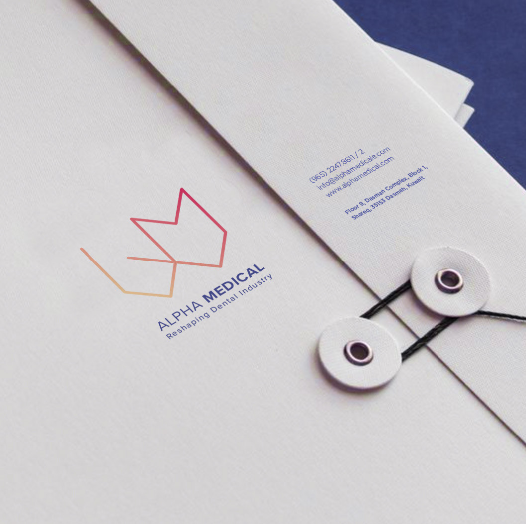
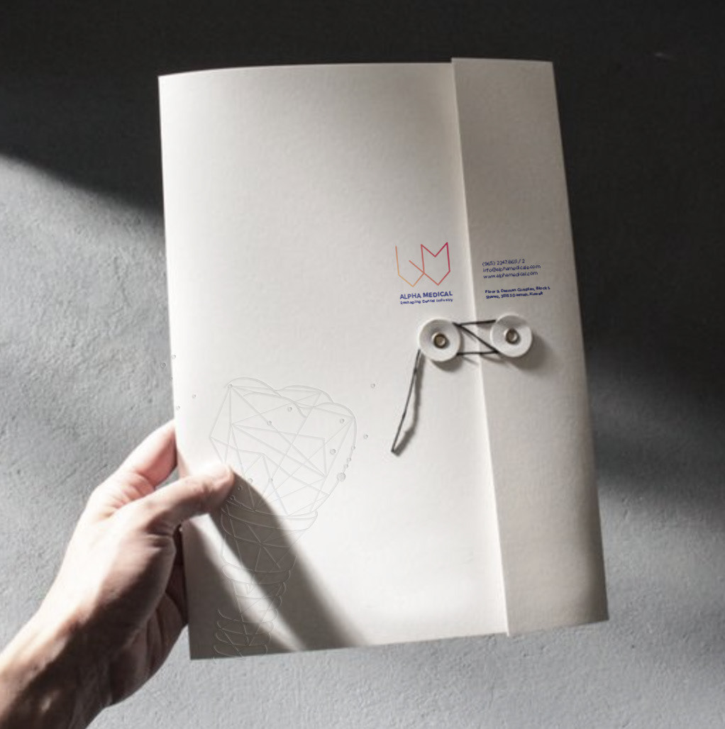
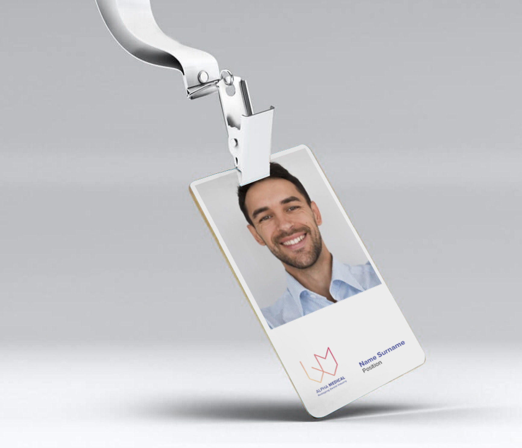
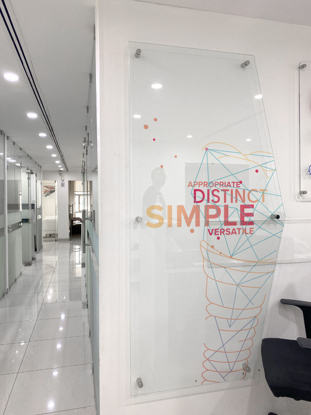
Alpha Medical is one of the largest and most distinctive projects I've worked on, alongside designer David Rustom. The company specialises in general, surgical, and cosmetic dentistry, and acts as a franchise carrier for large-scale dental manufacturers globally. This rebranding took three months from design to production—working closely with a British press to select paper stocks that met the exacting quality and image the brand called for.
In Kuwait's highly competitive dental market, and under the leadership of Dr George Saba, we set out to design something architectural and timeless—with animation possibilities built in for the future. The concept centred on Dr Fadi Saba, who established Alpha Medical in 2009, and the legacy his son has carried forward: service values, customer engagement, and lasting loyalty bonds with doctors and professionals. That reputation and strategic approach shaped the brand slogan we defined before entering the design phase—"Reshaping Dental Industry"—locked to the logo as a core part of the identity. It's a promise Dr George embodies by training his team to consistently meet the highest standards in communicating with both partners and clientele.
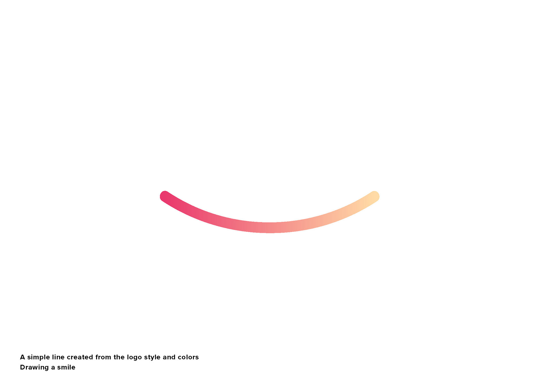
In the design phase, we brought this to life through a minimal aesthetic and strong marketing messaging, anchored by a visual element aimed directly at patients: a hand-drawn smile paired with the marketing message "Keeping You Well"—a reassurance to professionals and patients alike that the practice will always safeguard their health and wellbeing.
Corporate Re-branding Project
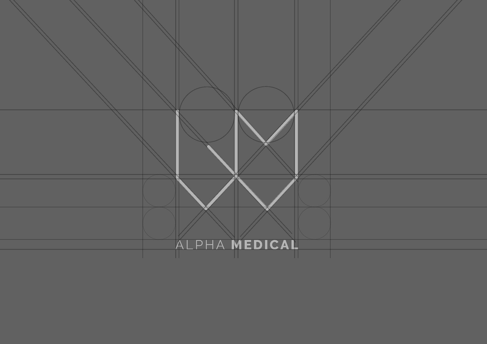
Logo Design Structure

Main Brand Graphic Element

Main Brand Graphic Element Variation
Main Brand Graphic Element Variation
Adaptation

Brand Application
Adaptation
Brand Application
Brand Application
Brand Application
Brand Application
Brand Application
Brand Application
Brand Application
Brand Application
Brand Application